Increase mobile checkout and basket conversion for FMCG e-commerce site
Wiltshire Farm Foods
As the UK's largest supplier of delivered frozen meals, it's critical that Wiltshire Farm Foods continually refine their e-commerce site in order to improve conversion rates. However, after making wholesale changes to their site after a recent re-brand it quickly became apparent that their mobile experience had suffered.
Overview
Wiltshire Farm Foods delivers frozen meals primarily for people aged 60 and above. With the increasing tech-savviness of consumers and their caregivers, the company has focused more on its digital experience. However, after a company-wide rebrand, the decision was made to 'reskin' the existing site with designs from the brand agency, which negatively impacted the mobile experience.
My role at MMT, a long-term partner of Wiltshire Farm Foods, involved revisiting the site since its redesign to identify opportunities for improvement in user experience and conversion rates. Working with a small team of developers and a Project Manager from MMT, with the client as the Product Owner, I aimed to drive valuable enhancements to the live site.
-
25 %
Increase in Checkout Conversion -
60 %
Increase in Mobile revenue -
20 %
Increase in Overall Revenue
Skills & Tools
User testing
User Interviews
Google Analytics
Exit Survey
Prototyping
Responsive Design
Interactive Design
Visual Design
Hotjar
Lookback
Optimal Workshop
Reframer
Sketch
Photoshop
Invision
Discover
Looking at Google Analytics it was clear that mobile conversion rates across the checkout journey were significantly lower than that of tablet and desktop. Additionally, ordering a brochure performed significantly poorer on mobile devices vs other devices. An exit survey on the basket page also indicated confusion around the voucher code and delivery messaging. Looking at the mobile design as a whole there was also a significant amount of scrolling and poor use of spacing, although this would need further validation.
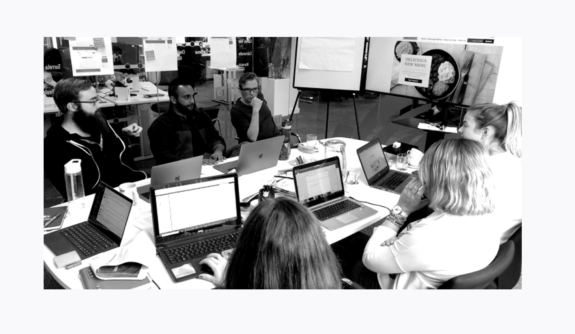
In order to validate our assumptions and explain the quant data, I ran a moderated remote testing session with 6 users who were tasked with researching and purchasing on the current site using different devices. Whilst I ran the session we had 2 UX researchers sit with the client in the observation room making notes. Importantly the session proved our assumption that the online experience on mobile was poorer than desktop but also provided many actionable insights.
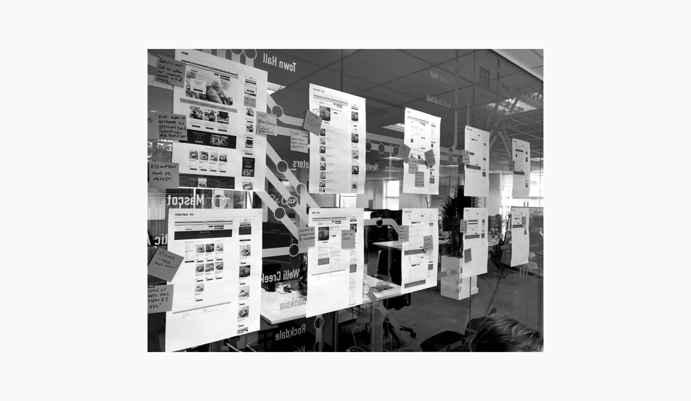
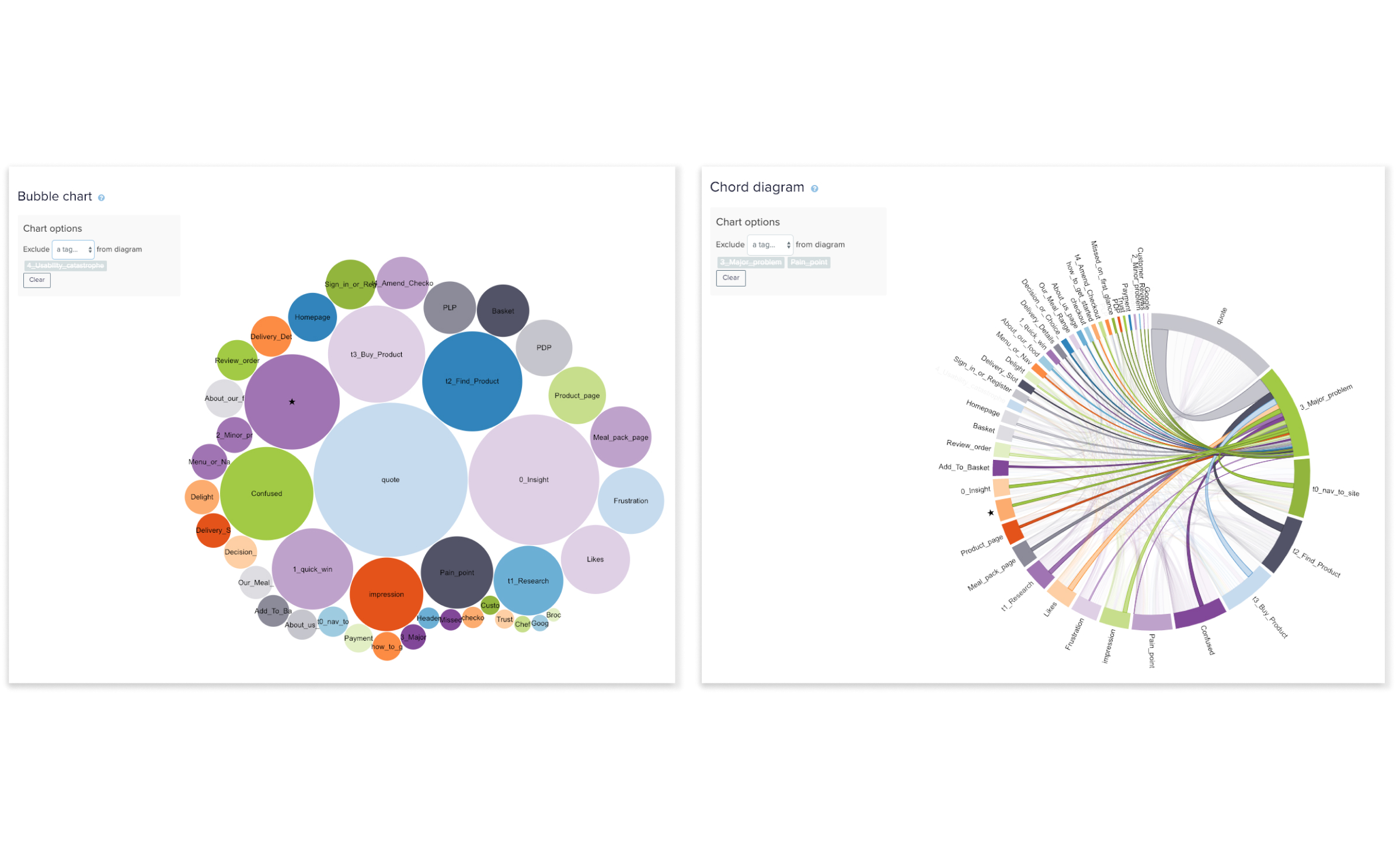
Using notes from the User testing session and Reframer, I grouped all the feedback and insights then ranked these by level of severity and listsed out opportunities and recommendations which would shape the upcoming development phase. The report also summarised user feedback on the experience as a whole and gave a System Usability Scale (SUS) for each user - desktop scoring 89% and mobile only 68%.
Define the challenges
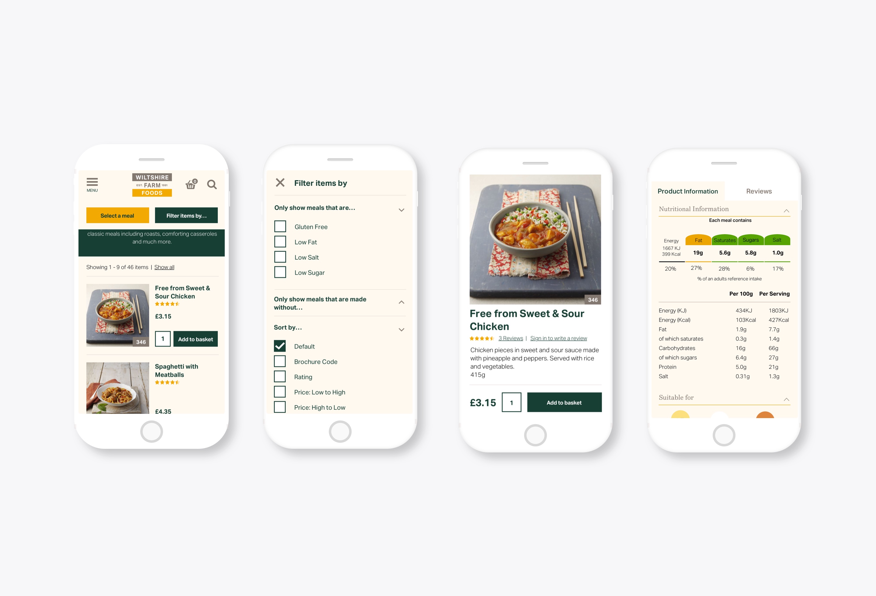
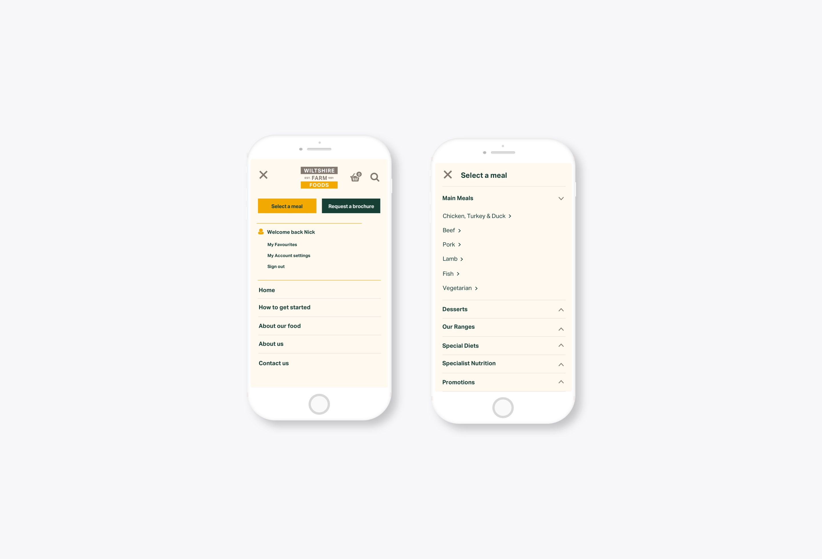
Mobile design
Moderated testing showed users missing key navigational items whilst also struggling with unnecessary scrolling when looking for meals and relevant information on mobile devices.
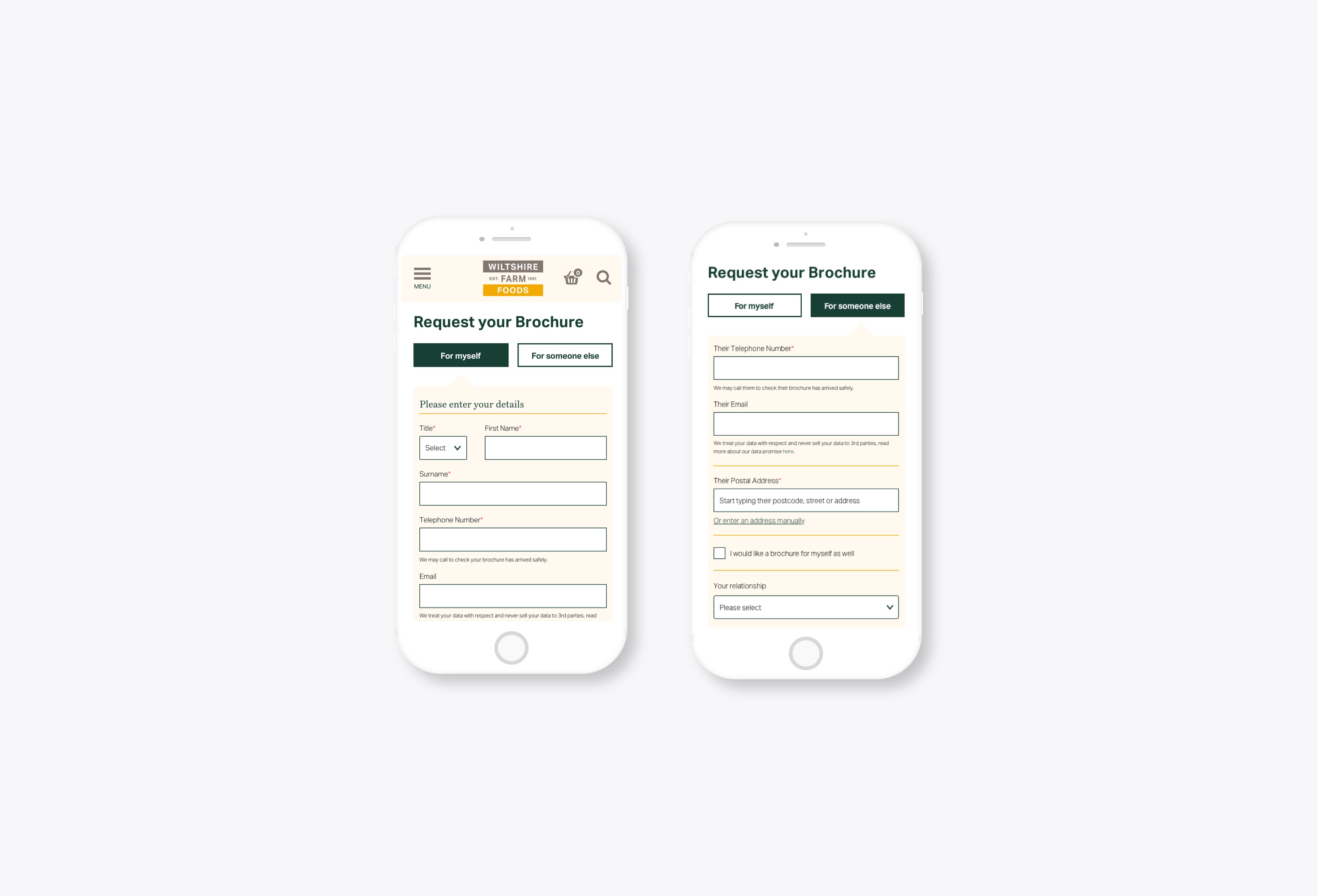
Brochure requests
Users requesting a brochure for a relative didn't understand which information to enter and were confused by multiple primary buttons.
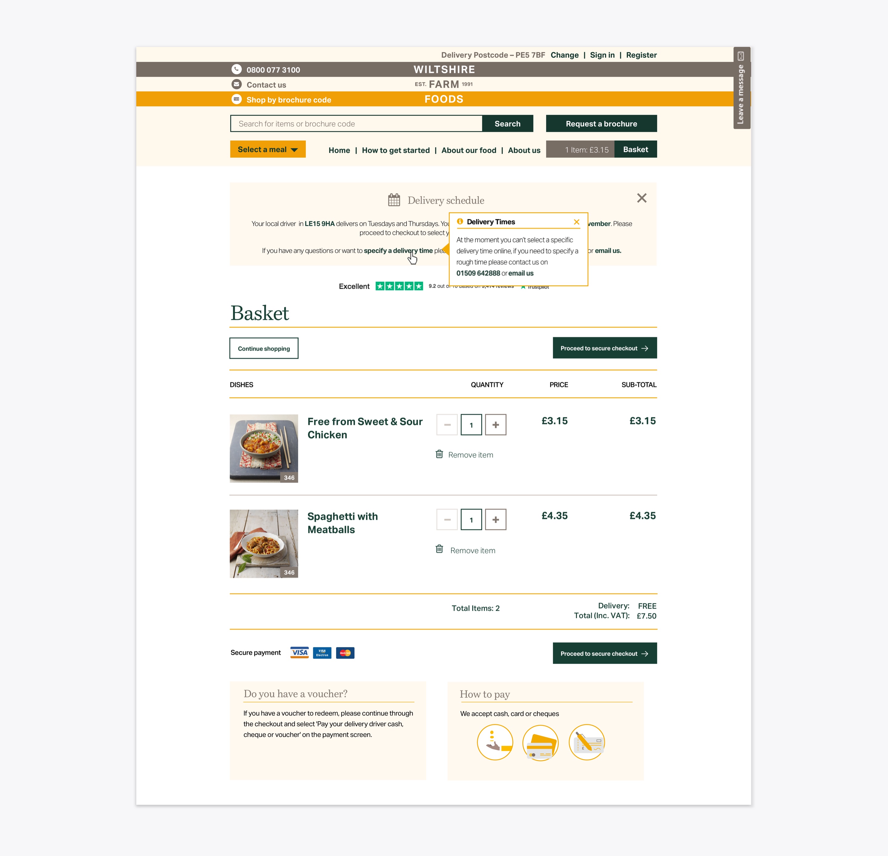
Basket conversion
Users would drop out of the site on the basket page when realising that they can't specify a delivery time. Vouchers could also not be redeemed on the basket page creating further doubt and frustration.
Develop the solution
Mobile design
The overall design of the mobile product and product listing pages proved frustrating with users scrolling and missing key Calls to Action (CTA). In particular the ability to filter products and select top menu items were often missed. Product information also felt overwhelming to many users who were looking just for nutritional data. In response, mobile images and headings were reduced in size in order to eliminate unnecessary scrolling. Product information was also prioritised and brochure codes, for first time users, were also explained. Menu items were also made 'sticky' (on scroll up only) so as to encourage smoother navigation.
Brochure requests
Requesting a brochure was simplified by removing the unnecessary CTA of requesting 'for myself and someone else'. By adding a checkbox under 'For someone else' the user could request an additional brochure for themselves. Grouping of form information also meant that the page, especially on mobile, was easier to scan. Additionally, attention to form labelling reduced confusion, for example, if ordering for someone else, labelling should be 'Their first name' rather than 'Name' giving better context.
Basket conversion
Because Wiltshire Farm Foods can't provide specific delivery times 50% of users during the testing session would abandon the checkout journey altogether. Additionally, vouchers can't be redeemed on the basket page which created doubt and frustration, with users unsure if they could redeem or not. Limited by resource and time I had to take a simpler approach. Messaging and franchise contact info was added as a tooltip when displaying delivery messaging whilst info about vouchers added to the basket page.
Outcome
Since working with Wiltshire Farm foods their e-commerce solution has gone from strength to strength based on both technical delivery and UX refinement, with significant increase in mobile conversion.
Why not drop me a line?
If you have an upcoming project and need help, I'd love to be involved! Just get in touch and let's get started.