Increase online engagement and bookings for English Forestry
Forestry Commission England
The Forestry Commission's key aims are to increase awareness about their work, drive visits to their woodlands and create a warm positive brand experience. The current site was struggling to meet these objectives as well as some of the more basic user requirements, as the team's Lead Experience Designer it was my responsibility to change this.
Overview
The Forestry Commission oversees more than 1,500 sites across the country, offering opportunities for people to enjoy their woodlands, support local rural businesses, and protect natural wildlife. As the Lead Experience Designer, it was my responsibility to understand who was visiting the site and why, identifying user pain points and objectives, and creating an engaging solution that met both organisational goals and user needs. I worked as part of an agile team consisting of developers, a project manager, and a technical product owner. This team was blended with key stakeholders from the Forestry Commission, with one acting as the product owner.
-
17%
Increase in event bookings -
48%
Increase in mobile views -
84
Net Promoter Score
Skills & Tools
Remote Testing
User Interviews
User Journeys
Information architecture
Exit Surveys
Guerrilla Testing
Client workshops
Proto-Personas
Prototyping
Wire framing
Visual Design
Interactive Design
Hotjar
Optimal Workshop
Treejack
Sketch
Photoshop
Invision
Discover
In order to understand how the site was performing I spent the first few weeks analysing Google Analytics data, collecting screen heatmaps and recordings through Hotjar and also set up an exit poll asking for feedback and a Net Promoter Score, rating the current experience. For desktop research, I examined competitors and similar sites facing challenges like engaging users with imagery, catering to diverse user groups, and facilitating site visits.
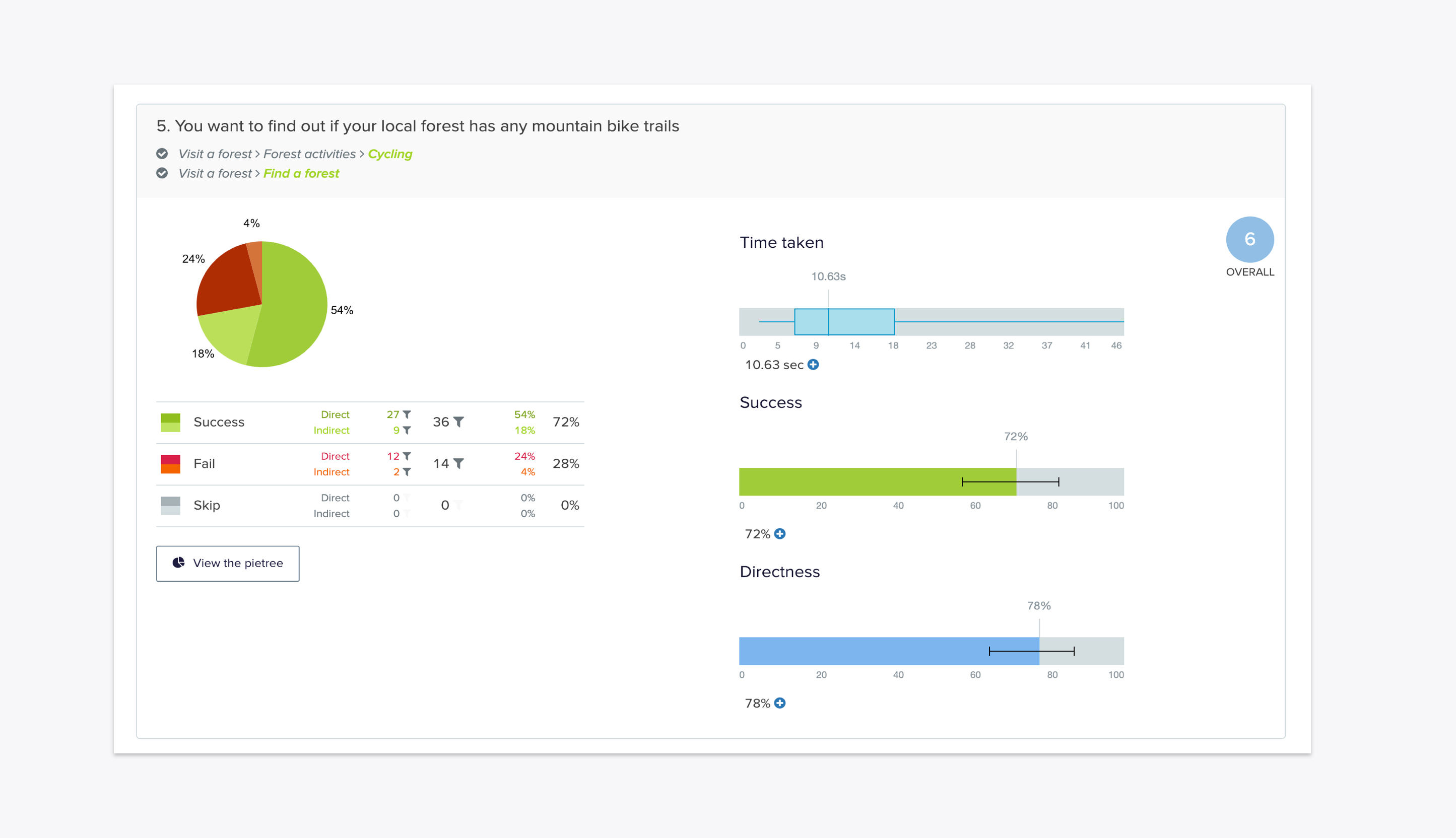
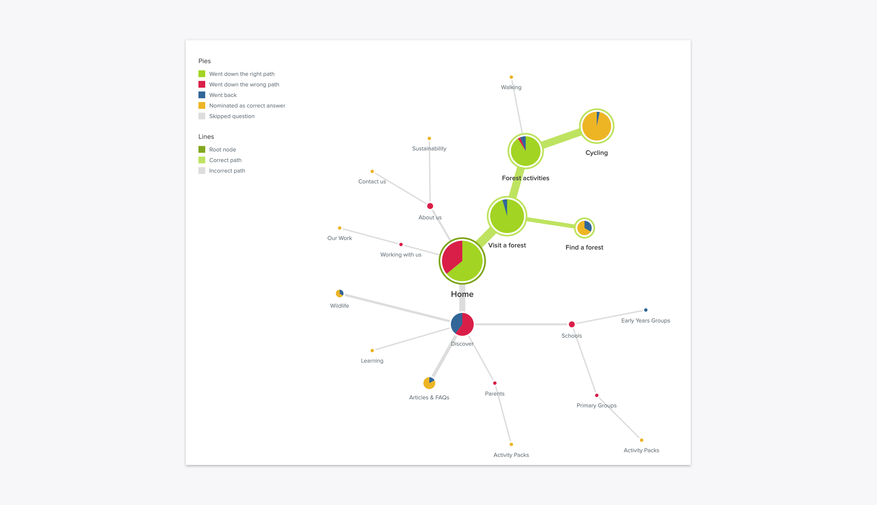
Qualitative research included a remote, unmoderated test on the live site where users planned activities, as well as in-person sessions with typical forest visitors followed by surveys. Using Optimal Workshop the time taken to perform these tasks was recorded for data. These sessions revealed user behavior and highlighted pain points such as awkward maps and misplaced content on the site.
Define the challenges
Find a forest
Both screen recordings and moderated tests demonstrated users struggling to find a nearby forest using either the current map or entering a postcode. This became even more apparent when observing users perform the same task on a mobile device.
Plan a visit
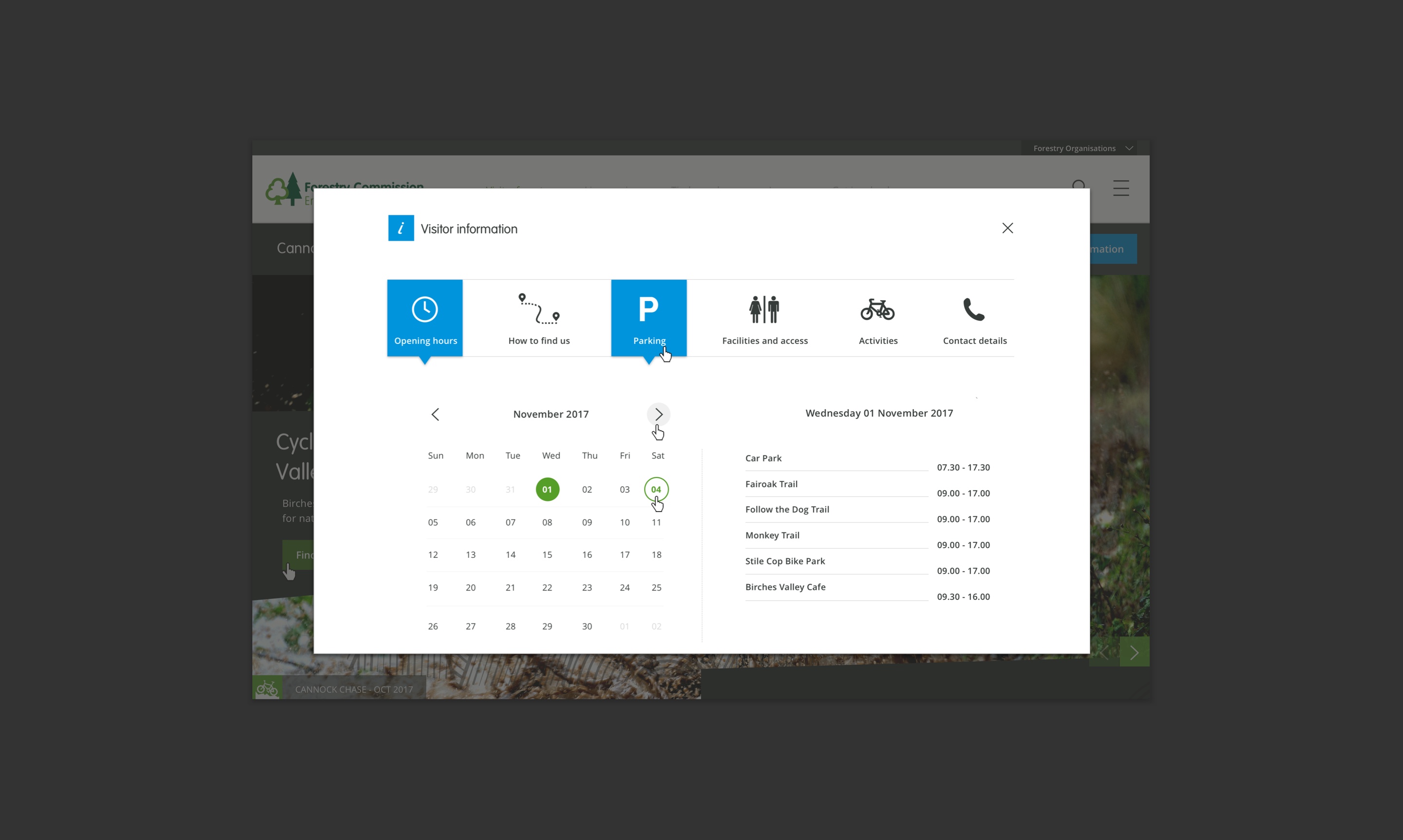
Unmoderated tests also showed that planning a visit often proved hard as users were unable to find basic information such as parking costs and facilities when viewing on a number of devices.
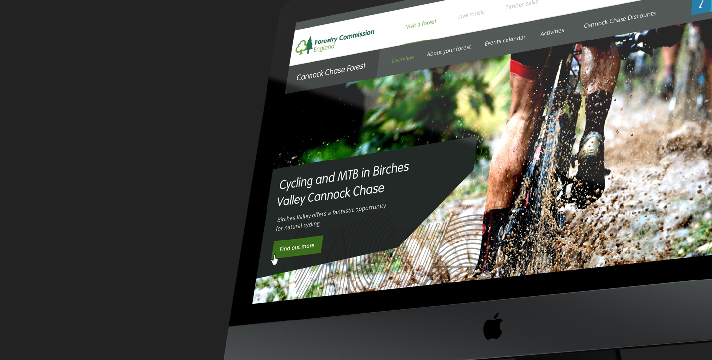
Create a tailored experience
Users looking for a particular forest activity, such as cycling, became disengaged when seeing totally irrelevant content such as concert imagery which neither addressed their specific need or inspired them.
Develop the solution
Find a forest
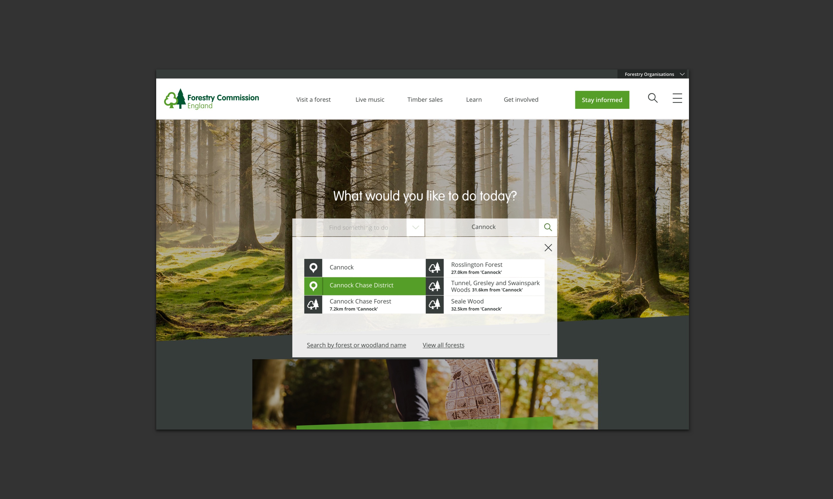
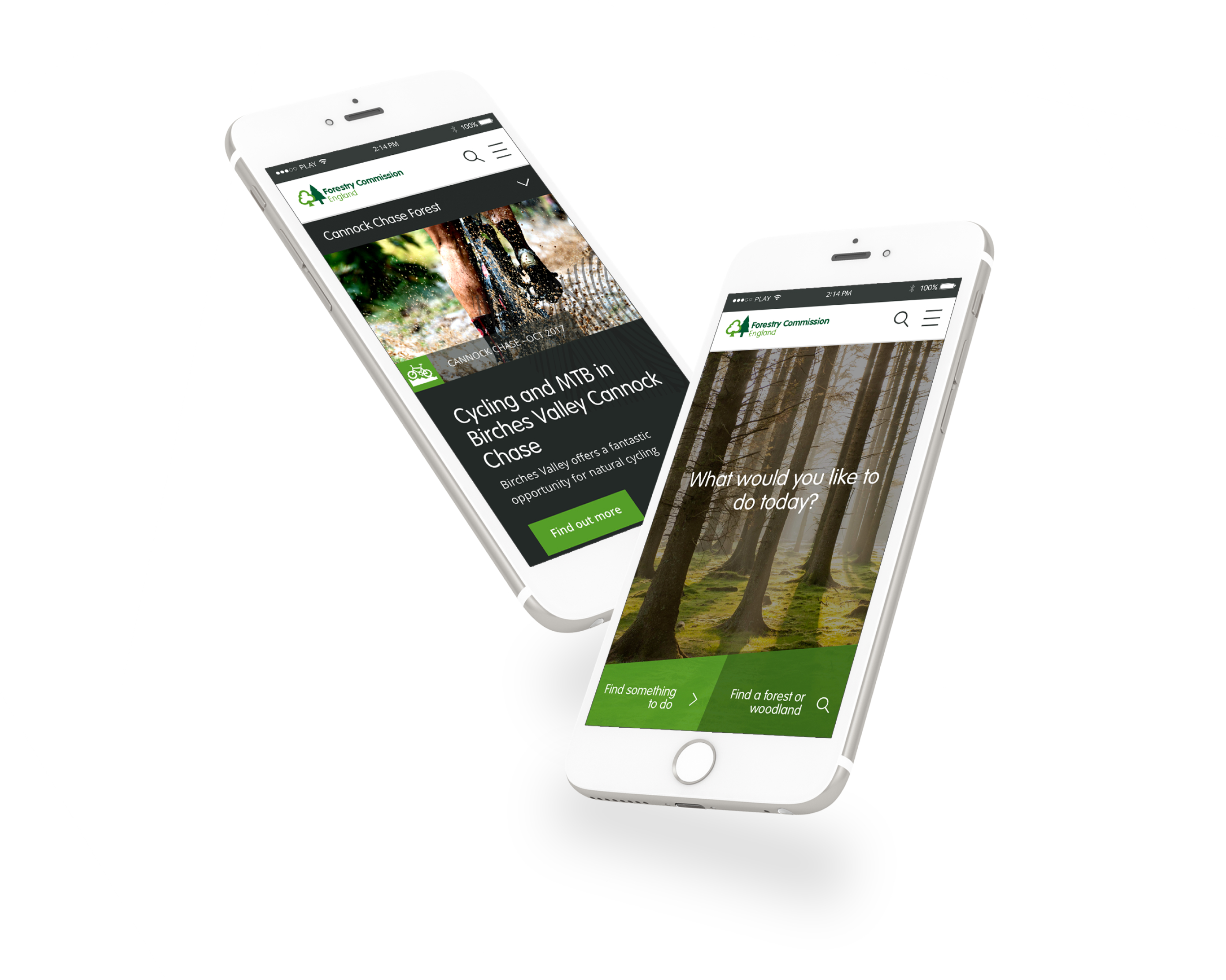
In order to increase site visits it was key to quickly direct traffic to the right forest landing page without any distractions. By adding a predictive search feature on the home hero banner we could ask for the users' geo-location or to alternatively enter a location or postcode which would dynamically produce a set of links to each forest's respective landing page. Alternatively, the user could select a preferred activity instead which would then drive them to an activity landing page listing nearby participating forests.
Plan a visit
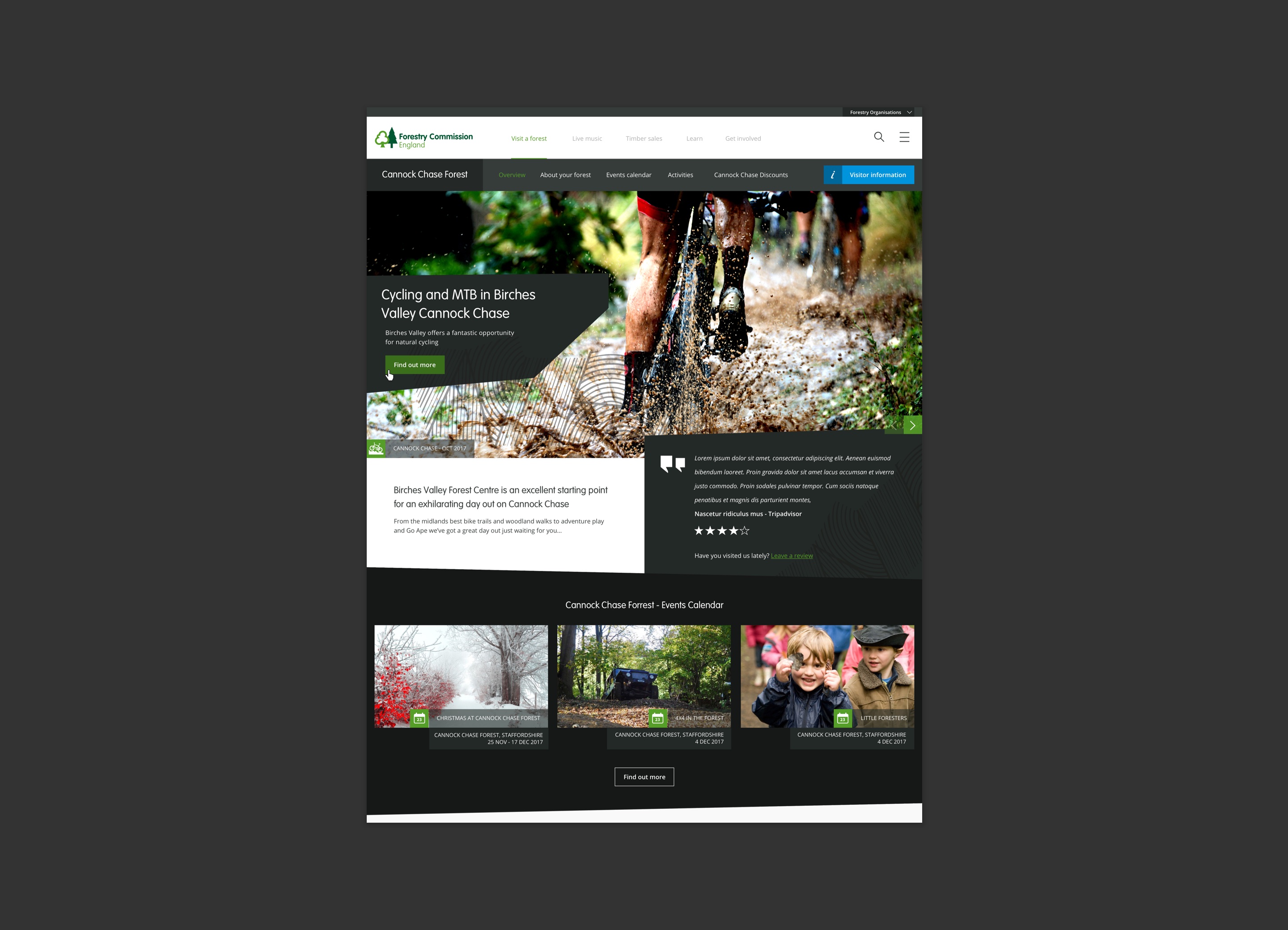
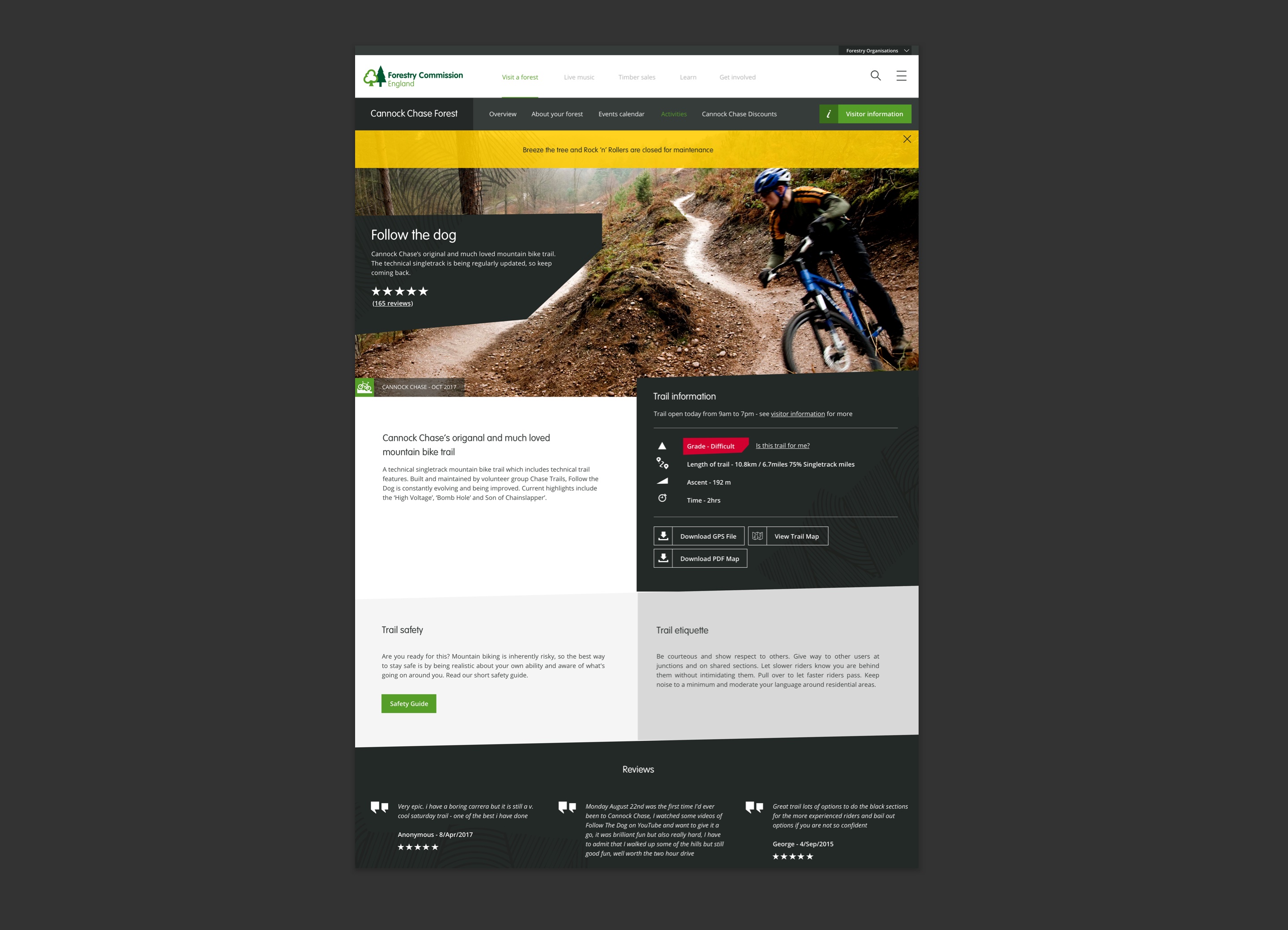
Users struggled finding and understanding visitor information on the original site. So I placed key visitor information on a separate layer that would work responsively. This meant that visitor information didn't need to visually compete with the rest of the forest landing page and users had the space to plan their visit. The call to action, 'Visitor Information' was given high prominence and for mobile would stick to the bottom of the page ensuring the user could see and access visitor info at any point, especially if they were in transit.
Create a tailored experience
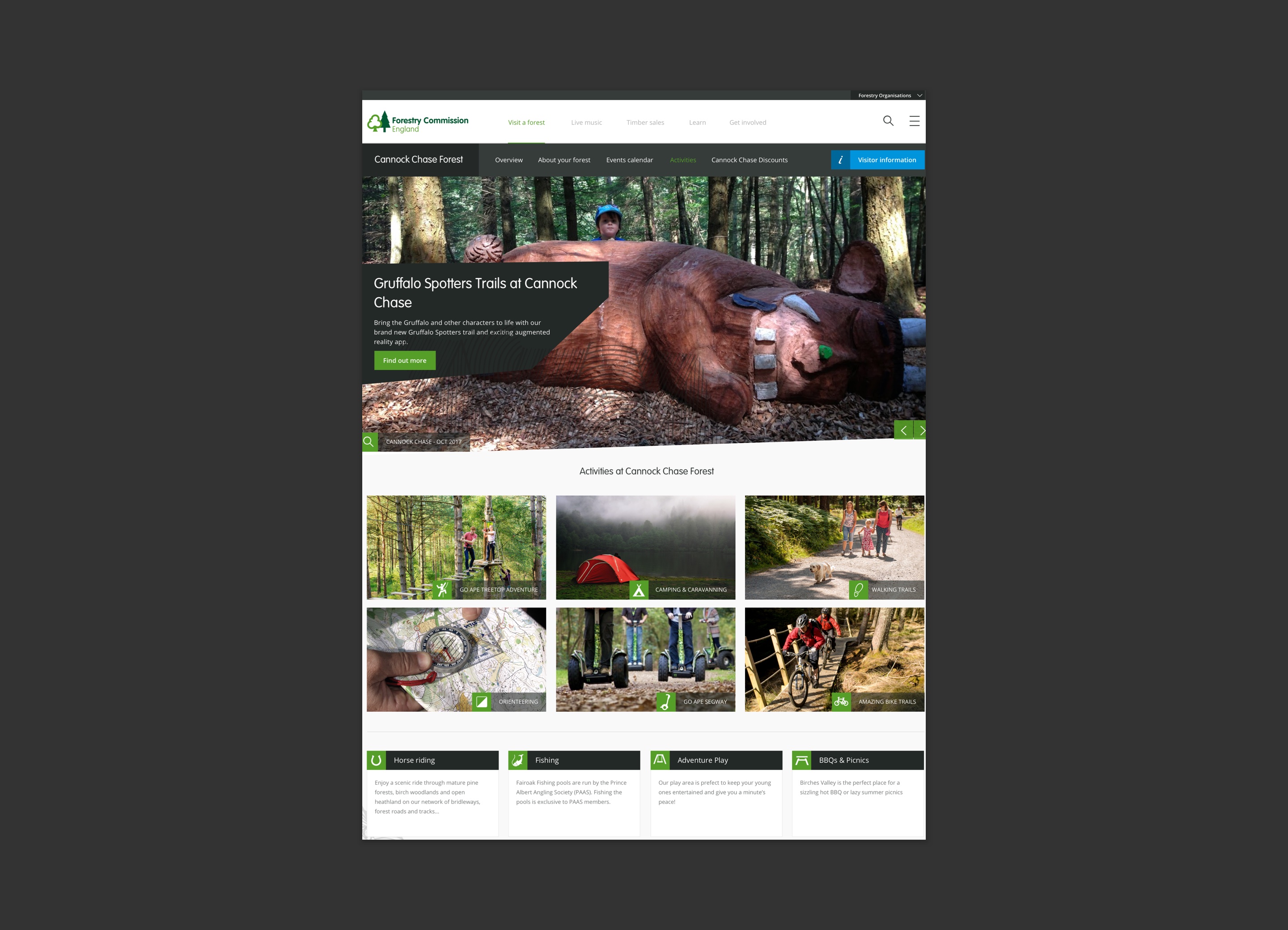
By creating user flows, I captured and summarised the content and features required for each persona's journey across the site. This process laid a solid foundation for building out the Information architecture (IA) and would help the project team understand and prioritise the work needed for the new site. Based on this, I mapped out the site's IA, with key sections focusing on specific user objectives such as music events, timber sales and volunteering. This was further validated with a Treejack testing session through Optimal Workshop, which challenged assumptions and prompted refinements to the site structure.
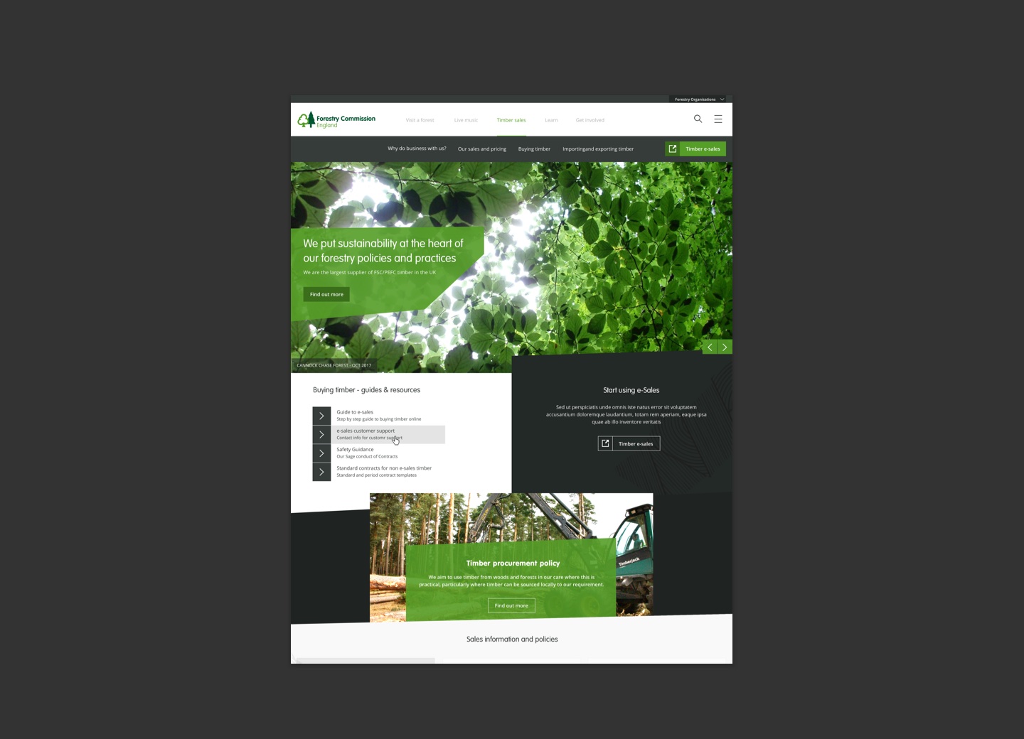
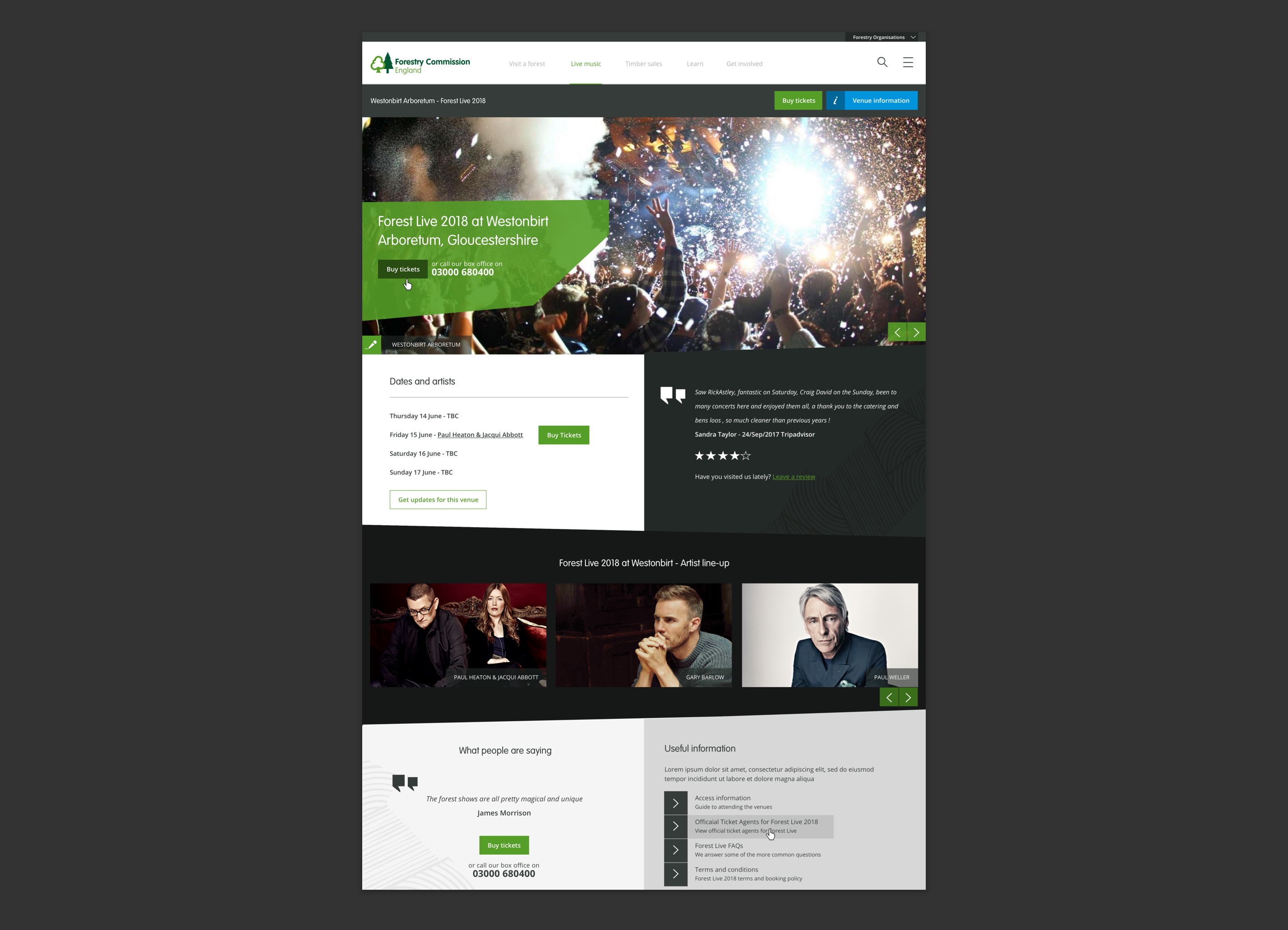
Based on the IA, the top navigation and the select activity feature on the homepage ensured that wildly different content, such as live music and timber sales were siloed. The visible navigation very much focussed on key user journeys identified during research with secondary links assigned to the mobile nav. The use of full bleed images and some of the visual elements taken from the Forestry's brand identity created consistency with offline material as well as much-needed engagement. This was flexible enough to work across a wide variety of material from art exhibitions, kids activities through to timber sales.
Outcome
I used the prototypes as part of guerilla testing and iterated on these based on feedback. Working closely with our development team meant that I could tweak the design in order to create a minimum viable product and meet the budget. In particular the home predictive search menu needed refining due to technical restrictions. The site was successfully launched with early positive indicators and feedback.
Why not drop me a line?
If you have an upcoming project and need help, I'd love to be involved! Just get in touch and let's get started.