Increase online lesson enquirires and mobile engagement for an aspiring premium brand
Waterbabies
As the UK's leading provider of swimming classes to newborns and toddlers, Waterbabies needed to transition to becoming a lifestyle brand in order to gain competitve edge over other activity providers. In order to achieve this, it was critical that their online experience became the main focal point for all their business and reflect their revitalised brand. Given the current site, there would need to be a shift in thinking and design in order to achieve this.
Overview
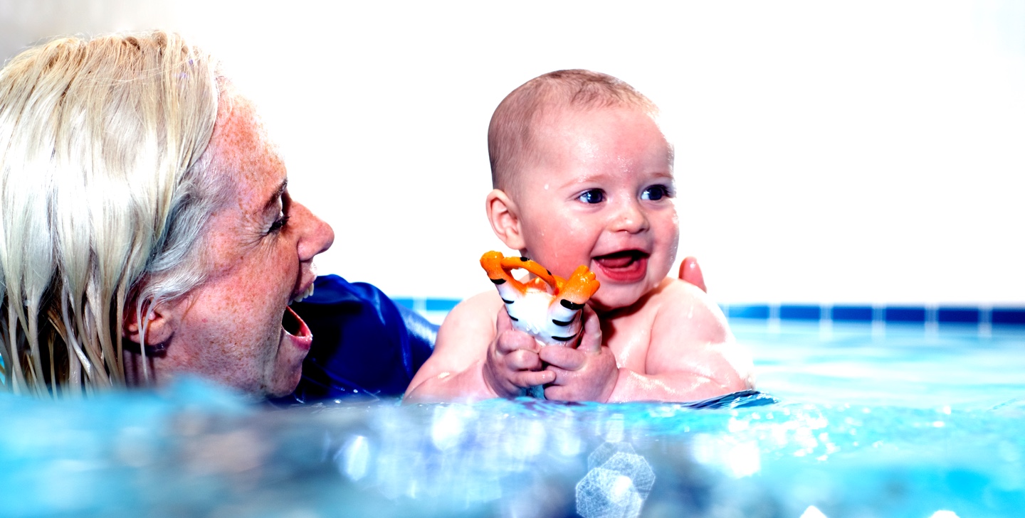
Waterbabies aims to enhance child development through enjoyable swimming lessons in a nurturing environment. Redesigning their website marks their first step in transitioning their business online. In my role as lead designer, I had six weeks to research and develop designs that met the client's goals of increasing lesson enquiries while also fulfilling user needs. I collaborated with an agile team comprising of developers, a technical product owner, and a project manager whilst a member of Waterbabies oversaw the team as the product owner. Additionally, a UX designer supported me in this project.
-
58%
Increase in mobile traffic -
46%
Increase in mobile lesson enquiries -
32%
Increase in overall enquiries
Skills & Tools
Heatmapping
Exit Surveys
Online Survey
User Journeys
Information architecture
Treejack Tests
User testing
Responsive Design
Interactive Design
Visual Design
Hotjar
Optimal Workshop
Sketch
Photoshop
Invision
Discover
I conducted quantitative research using exit surveys, page recordings, and heatmaps to identify areas of the site that didn't meet user needs. Feedback highlighted issues with lesson information, availability and site navigation. An online survey of existing customers revealed that the site didn't always reflect the quality of lessons and was overshadowed by competitor sites.
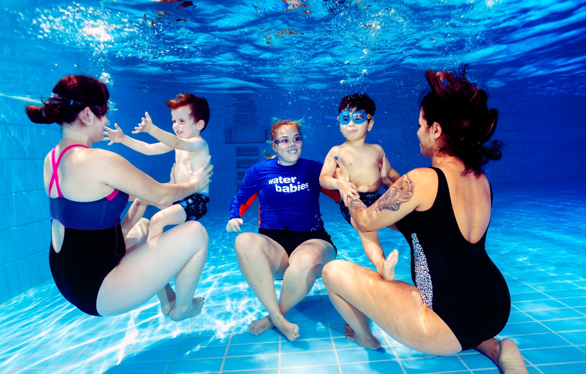
In addition, desktop research involved analysing direct competitors and millennial brands appealing to Waterbabies' primary audience. Existing research emphasised the importance of a frictionless mobile experience for generating enquiries, considering new parents' limited time for desktop research.
Define the challenges
Increase online lesson enquiries
Given the short turnaround of the project the main business objective was to increase the number of new users making lesson enquiries. However, research confimred that users were unable to quickly find basic class information and contact links for their local pool, negatively impacting the number of lesson enquiries.
Support lesson value
Parents researching swimming lessons are not immediately aware of the teaching quality, results promise or how Waterbabies are uniquely different from other lesson providers.
Reflect a premium lifestyle brand
New and existing customers felt that the current site was friendly but didn't reflect the quality of the service Waterbabies provide.
Develop the solution
Increase lesson enquiries
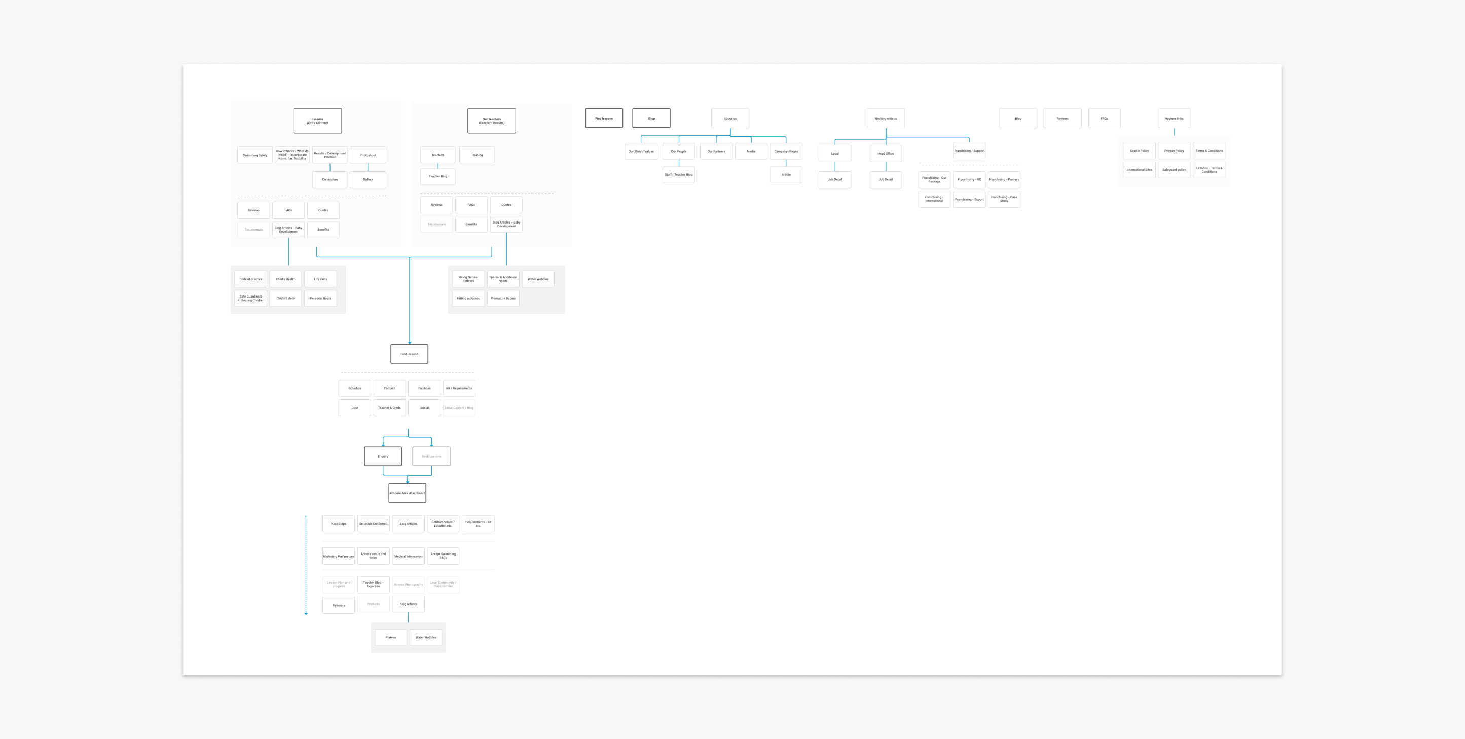
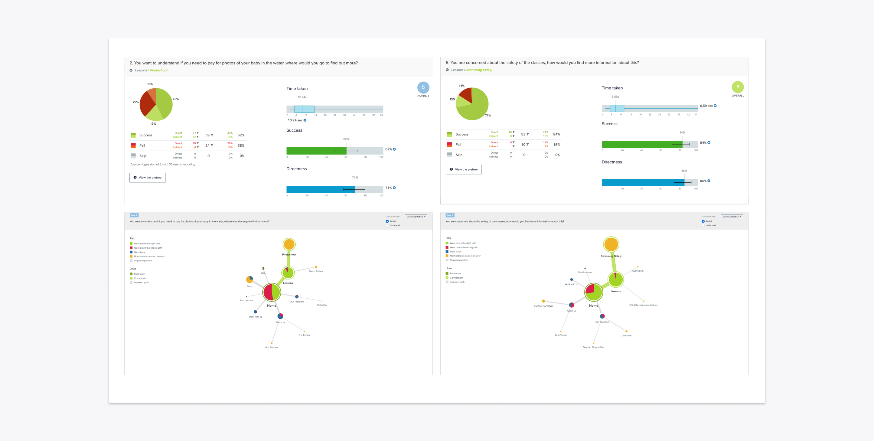
The site's navigation was reworked in order to 'push' new users towards booking lessons. This involved re-organising content in order to prioritise entry-level information. After running click tests on the navigation, it also became apparent that users were predominantly focussed on teacher quality rather than Waterbabies USPs, so there was a new shift towards promoting teachers instead.
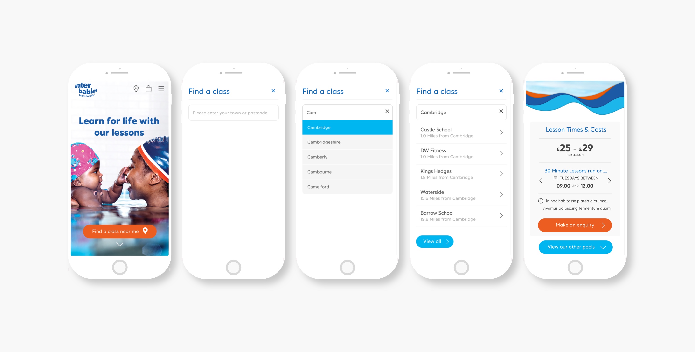
Landing and content pages became more effetive after adding a clear, simple lesson look up feature allowing new users to access local lesson information. Lesson pages would give franchise contact details and provide bite size details around costs, times and local pool facilities which suited time poor parents. This is in stark contrast to the original site where local pool information was part of a wider franchise landing page which was often content heavy and lacked the UI to handle key information.
Support lesson value
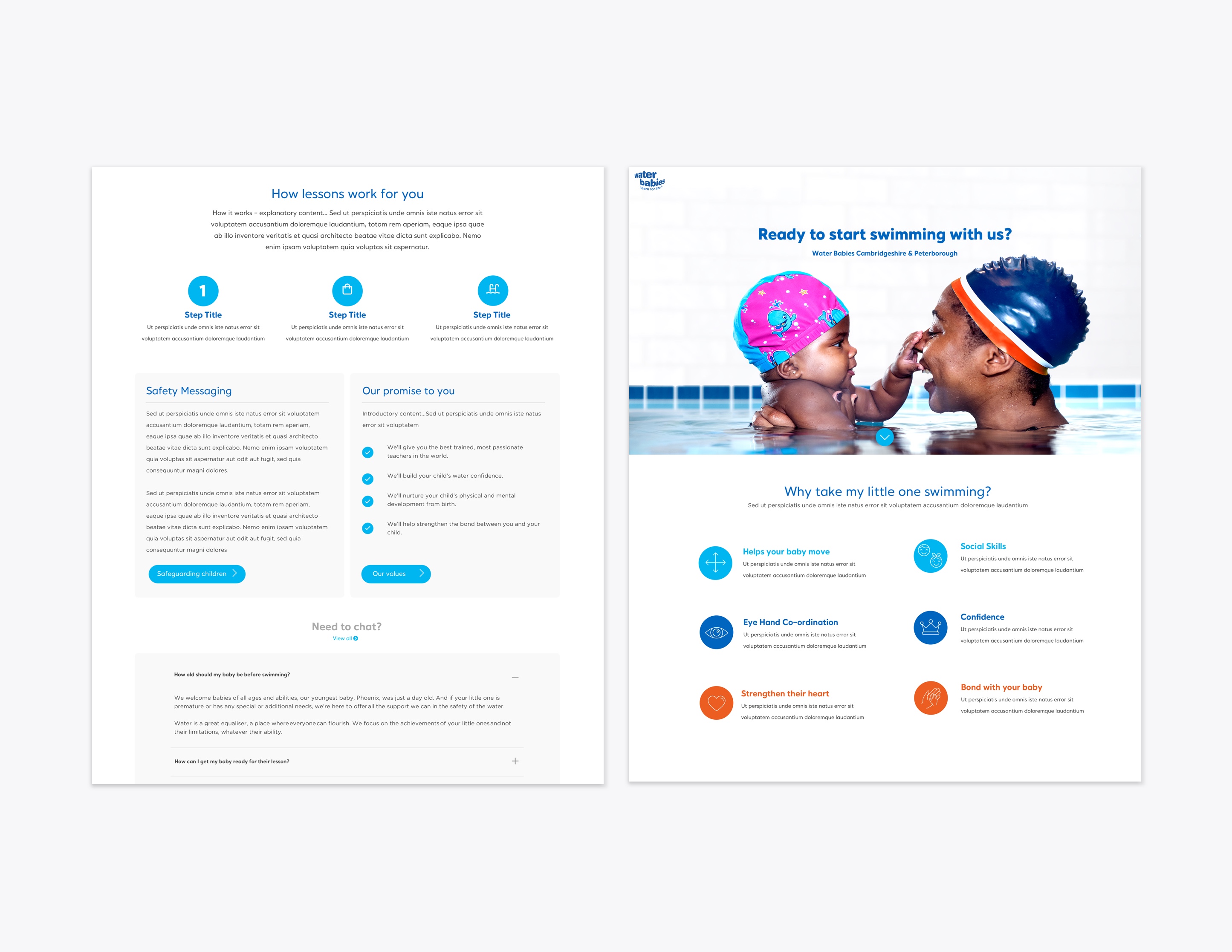
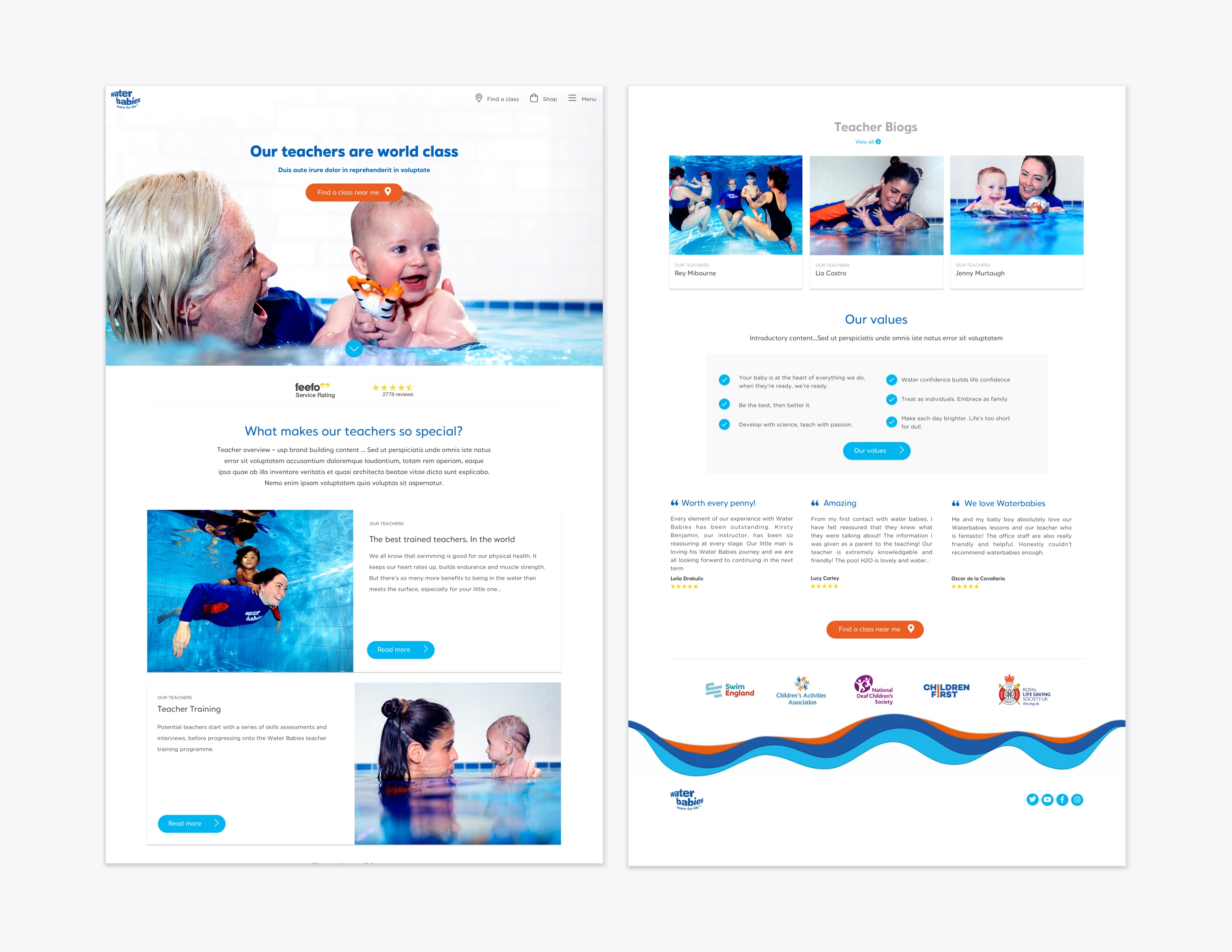
Site content would need to provide basic entry level information, such as swimming safely and how to content, but also differentiate Waterbabies from other providers. By creating a section focussing on teachers and giving them a platform to write articles as well as create biog pages, I was able to provide parents the opportunity to understand Waterbabies premium offering. This was further supported with lesson photography and bite size content focussing on child development and company values.
Reflect a premium lifestyle brand
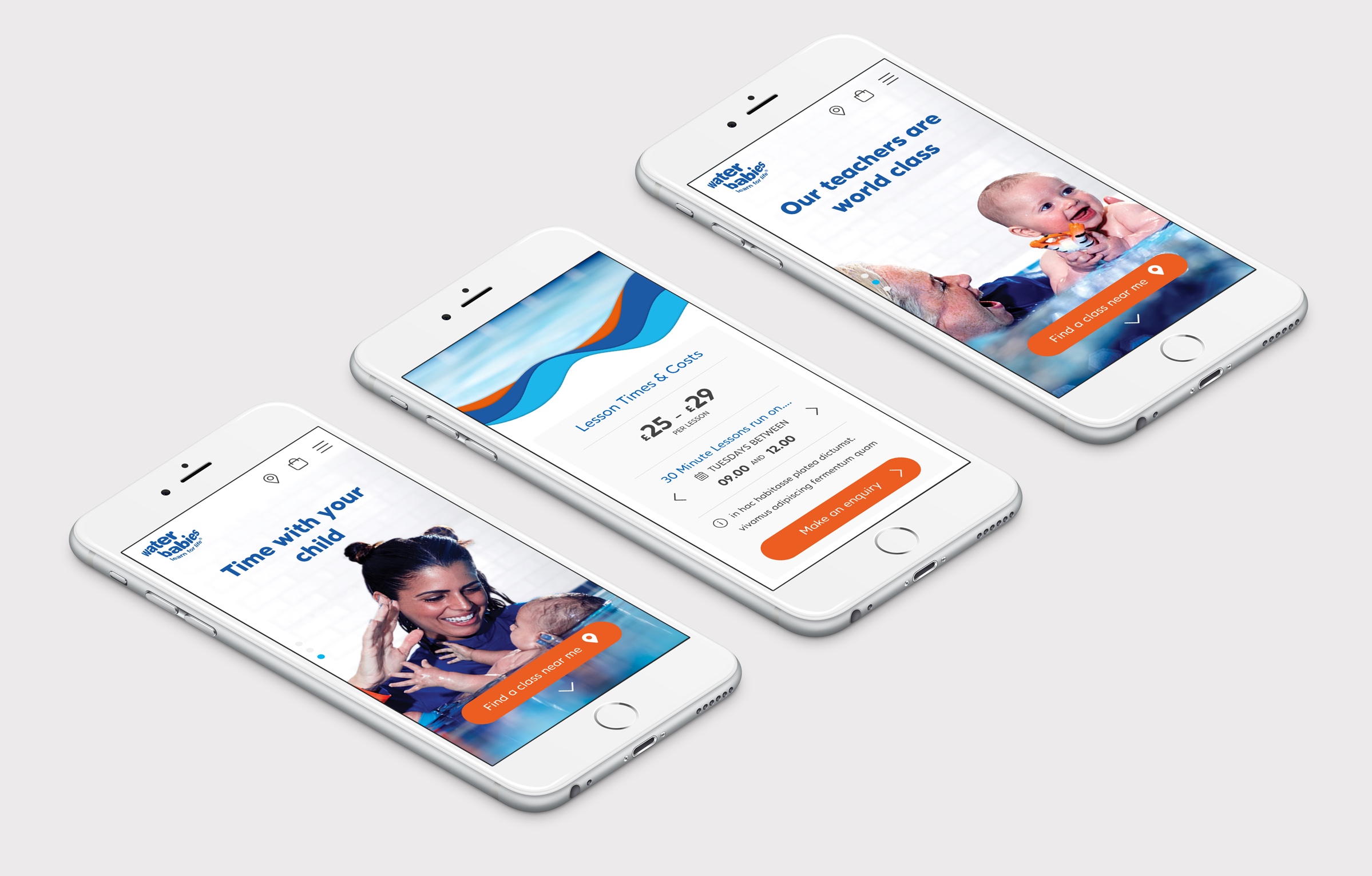
In order to position Waterbabies as a premium lifestyle brand, I purposefully stripped back the design to ensure that the new photography became the main focal point alongside key messaging. Along with the main Call to Action (CTA) this would fill the entire page creating engagement and drive users to lesson pages. Waterbabies bright brand colours were used sparingly against whites and greys along with simple outlined iconography which ensured that pages remained free of any unnecessary noise creating a premium look and feel.
Outcome
The first release of the site (MVP) proved successful with franchisees adopting the new look and feel and users making more enquiries. Designs will now roll out to international sites and work on the shop and new online booking system under way.
Why not drop me a line?
If you have an upcoming project and need help, I'd love to be involved! Just get in touch and let's get started.