Increase bookings and account requests for UK courier
City Sprint
The courier sector has been flooded with start-ups making competition for market share challenging. This dramatic change led City Sprint to undertake a complete brand refresh and review its online booking processes in order to maintain their market position. It was my task to understand and create an improved booking experience as well as translate their new brand online.

Overview
City Sprint offers nationwide courier services for consumers and businesses, as well as tailored logistics solutions for account holders in sectors like publishing, healthcare, and tech. As the Lead Designer, I collaborated with the client to understand their customers and create a digital solution aligning with business objectives and user needs. I worked in an agile team with a product owner from City Sprint, a project manager, technical product owner, and developers from MMT Digital.
-
30 %
Increase in Booking Visits -
29 %
Decrease in Booking Bounce Rates -
12 %
Increase in Account Requests
Skills & Tools
Google Analytics
Screen Recordings
Heatmaps
Exit Surveys
Guerilla Testing
Client workshops
Proto-Personas
Hypothesis Statements
Information architecture
Prototyping
Interactive Design
Visual Design
Hotjar
Axure
Sketch
Photoshop
Invision
Discover
In order to understand the site's performance, we set up a number of conversion funnels in Google Analytics as well as a Hotjar account in order to collect user information and feedback. In particular, we focused on traffic interacting with the initial quote feature on the home page, booking conversion and account creation. As part of the research I also ran a UX audit across the current site focussing on tracking and booking journeys. Additionally, I looked at a number of other courier and delivery sites to better understand the industry as well as identify potential opportunities.
Research was played back to the client as part of a one day workshop. As a team we also identified business objectives and created quick proto personas. Focussing in on our top 3 personas we listed their pain points and objectives and started to detail their desired outcomes and the site features needed to meet these. Based on this, we were able to then start ideating and create a roadmap of features for the site.
Define the challenges
Quotes & tracking
New and existing customers need to quickly access quote and tracking information. Research had indicated that this was currently far from frictionless.
Improve the booking experience
In order for City Sprint to increase online orders, customers needed an improved, intuitive booking experience.
Account sign up
Prospective businesses need to understand City Sprint's offering and qualify them as a trusted provider before creating an account.
Develop the solution
Quotes and tracking
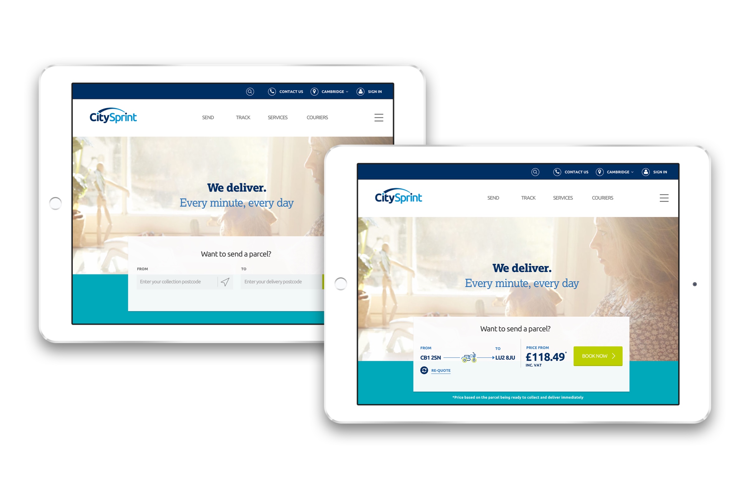
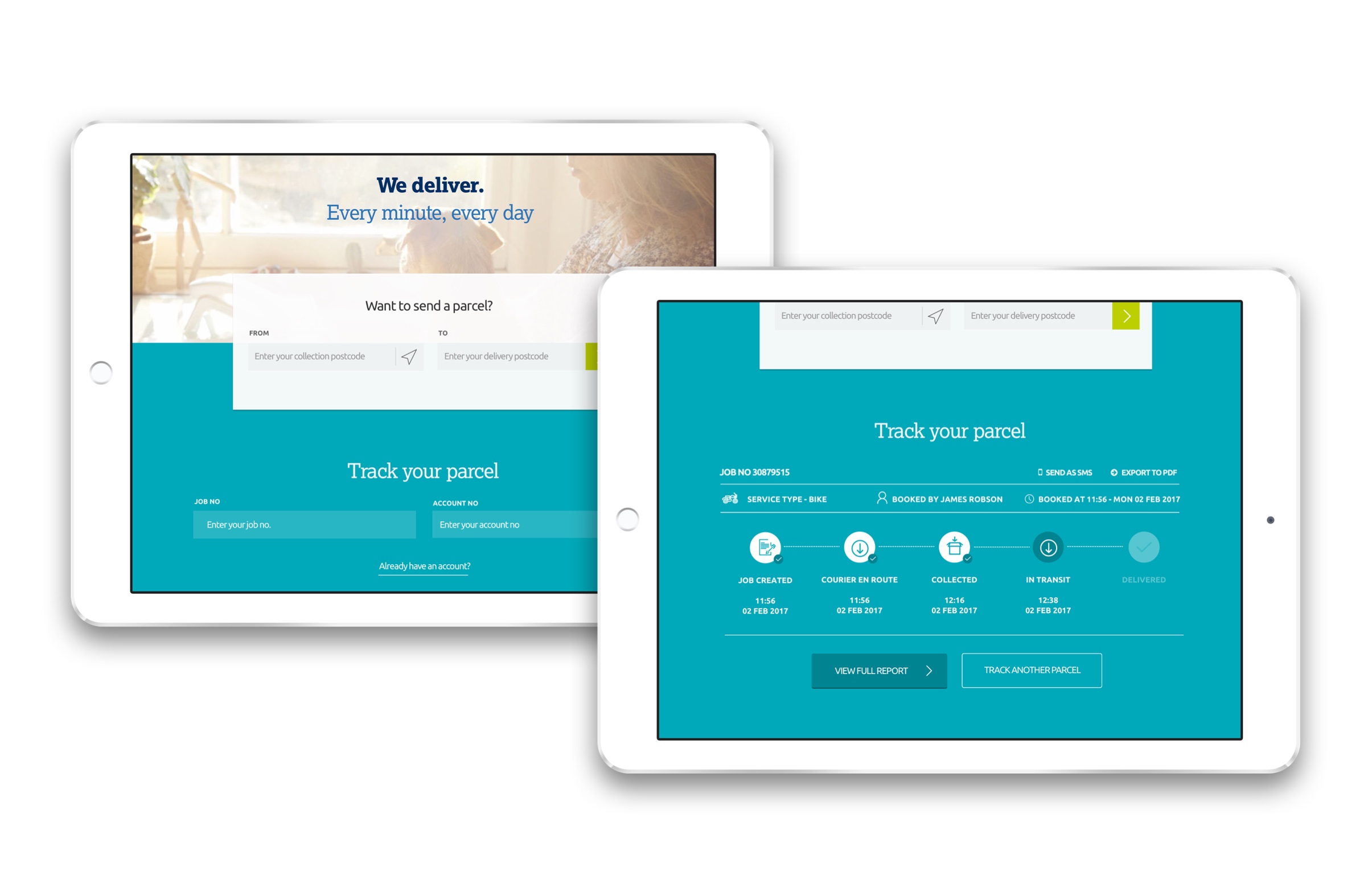
Users and City Sprint had identified the site as being obstructive when finding information and accessing services. In addressing this, I designed quote and tracking features for the home page in order to quickly provide information as well as drive new customers into the booking journey. By removing secondary input fields and caveating the information, quotes could now be produced with fewer barriers.
Based on the output from discovery it was also clear that the site navigation was overly complicated and didn't address some of the key user requirements. Users needed a way to quickly access booking and tracking pages but also qualify City Sprint as a trusted supplier. As a result, site navigation was simplified to 4 top navigation links. Track and Send links were given more prominence, supporting booking, whilst business and courier sections would cater for procurement and recruitment journeys.
Improve the booking experience
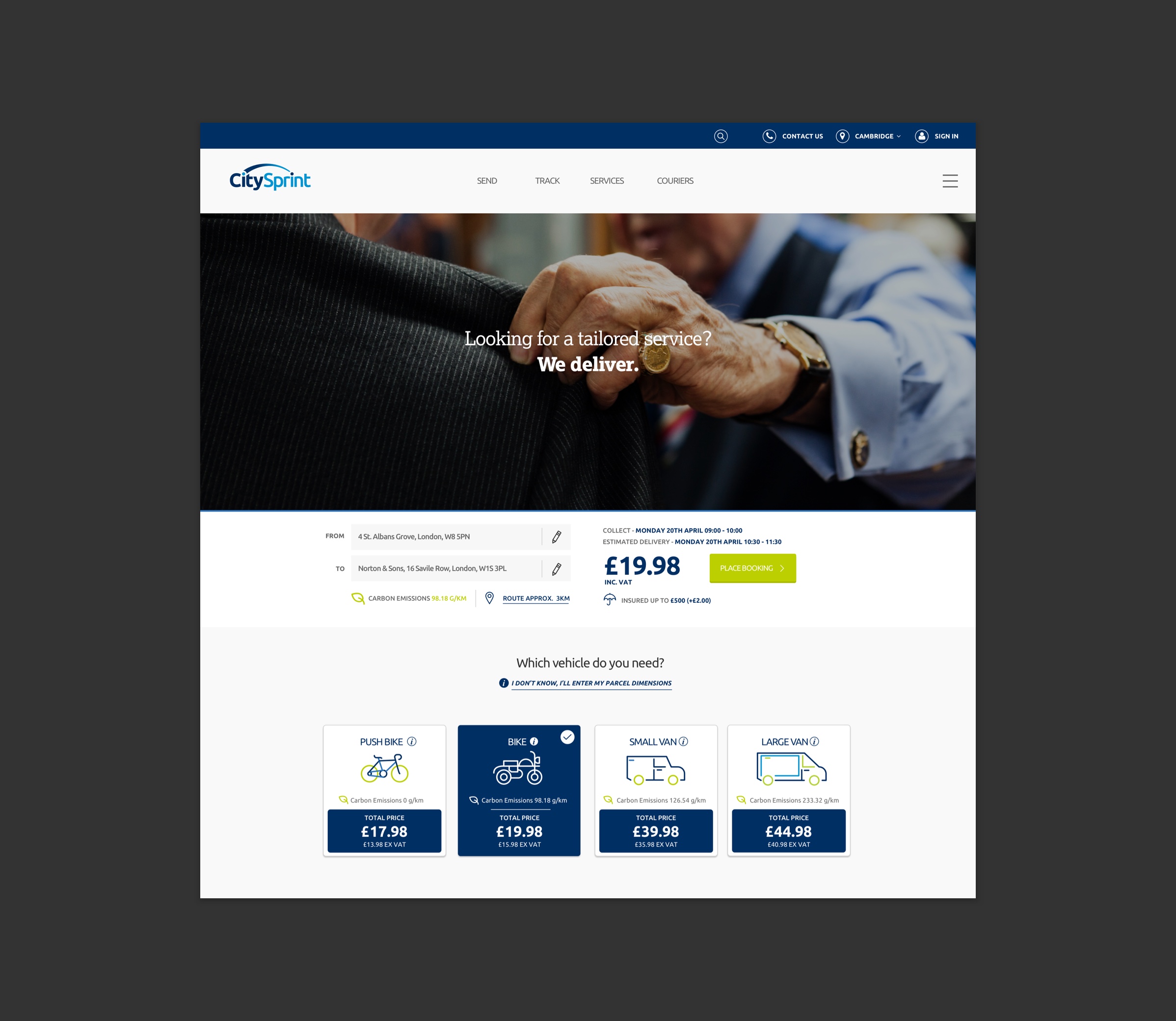
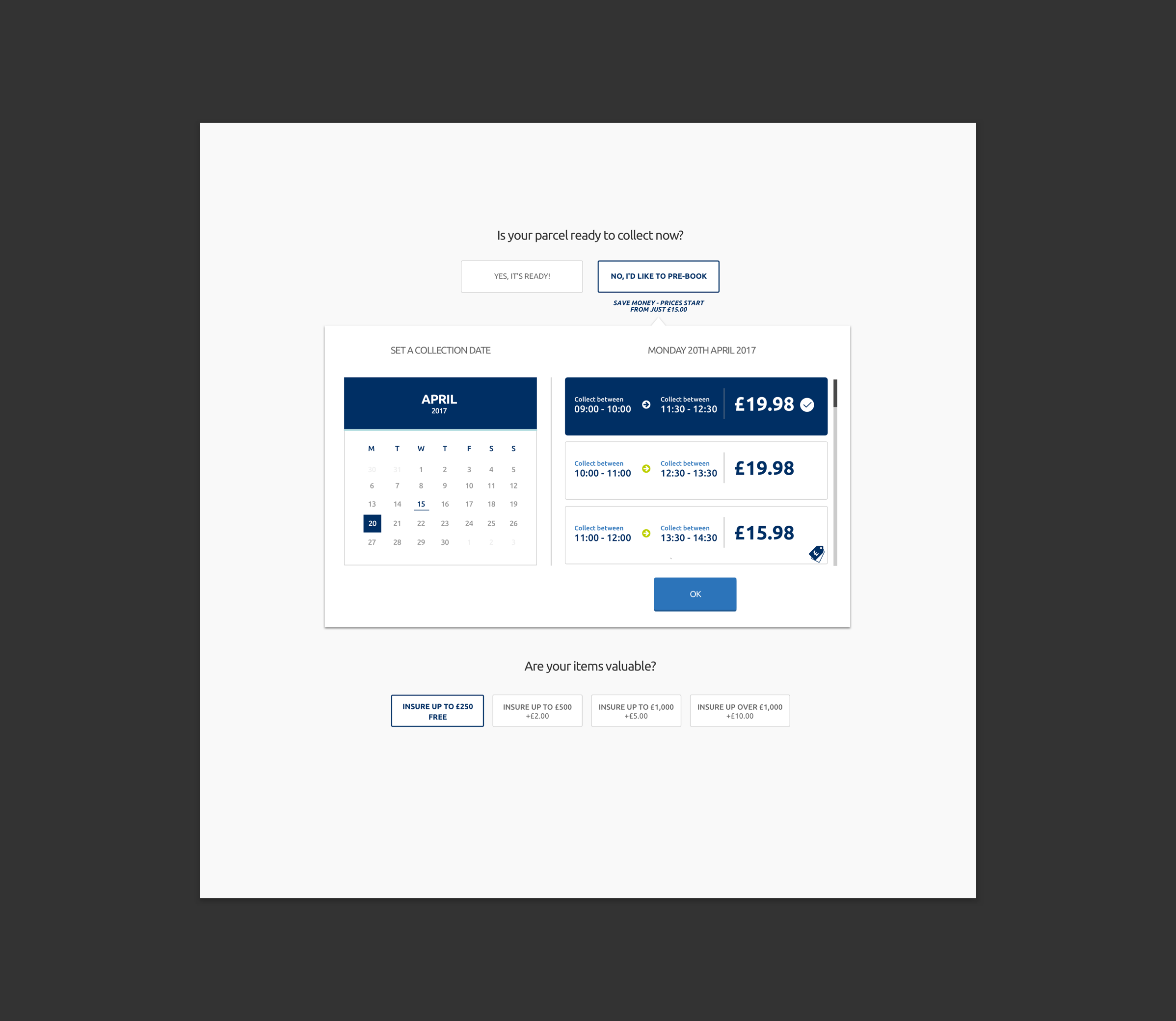
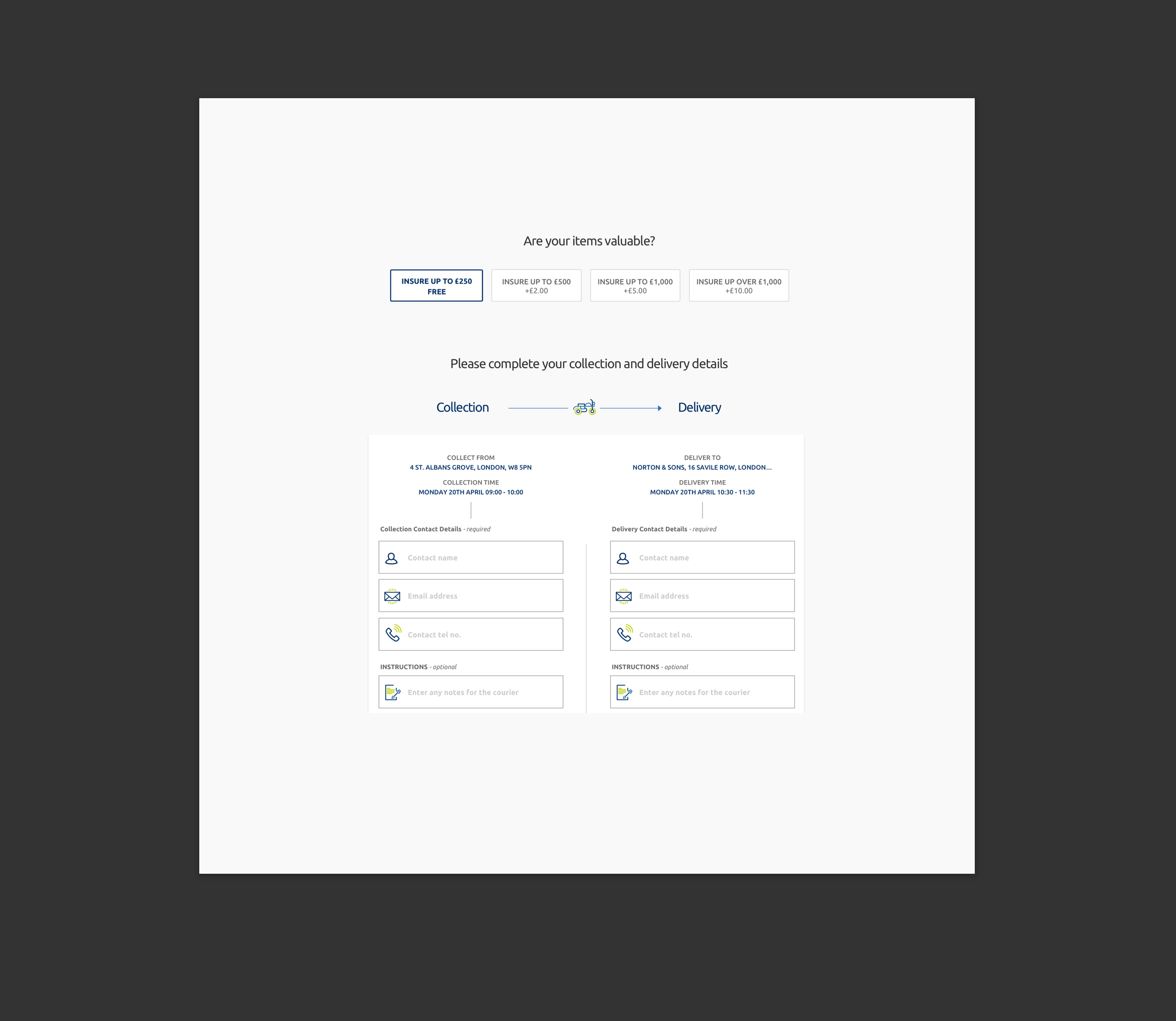
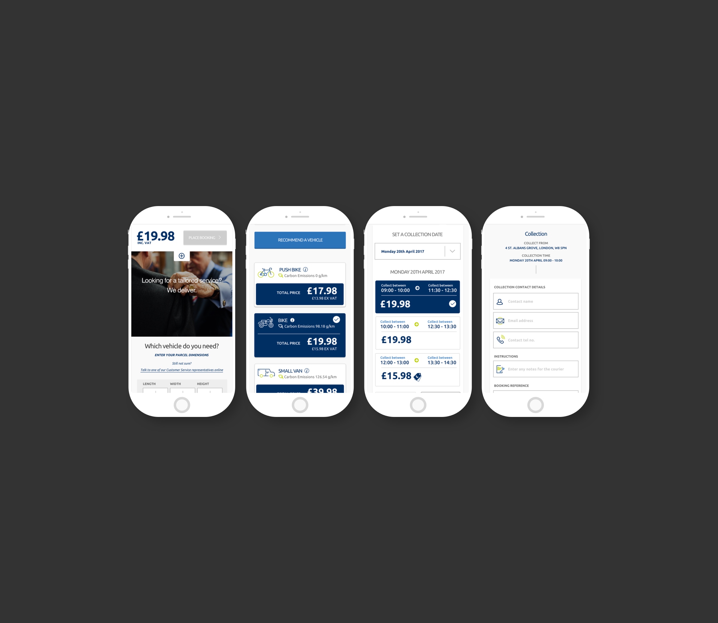
In order to simplify the booking process form items would be presented piecemeal through 'Progressive Disclosure' so as not to overwhelm users. This allowed the user to focus on one task at a time without any visual clutter. In turn, traditional form inputs were given more space and graphical treatment using City Sprint's new iconography, making the whole process both simple yet engaging. As mobile usage increases it was also key for the design to work responsively and create an equally intuitive experience.
Account sign up
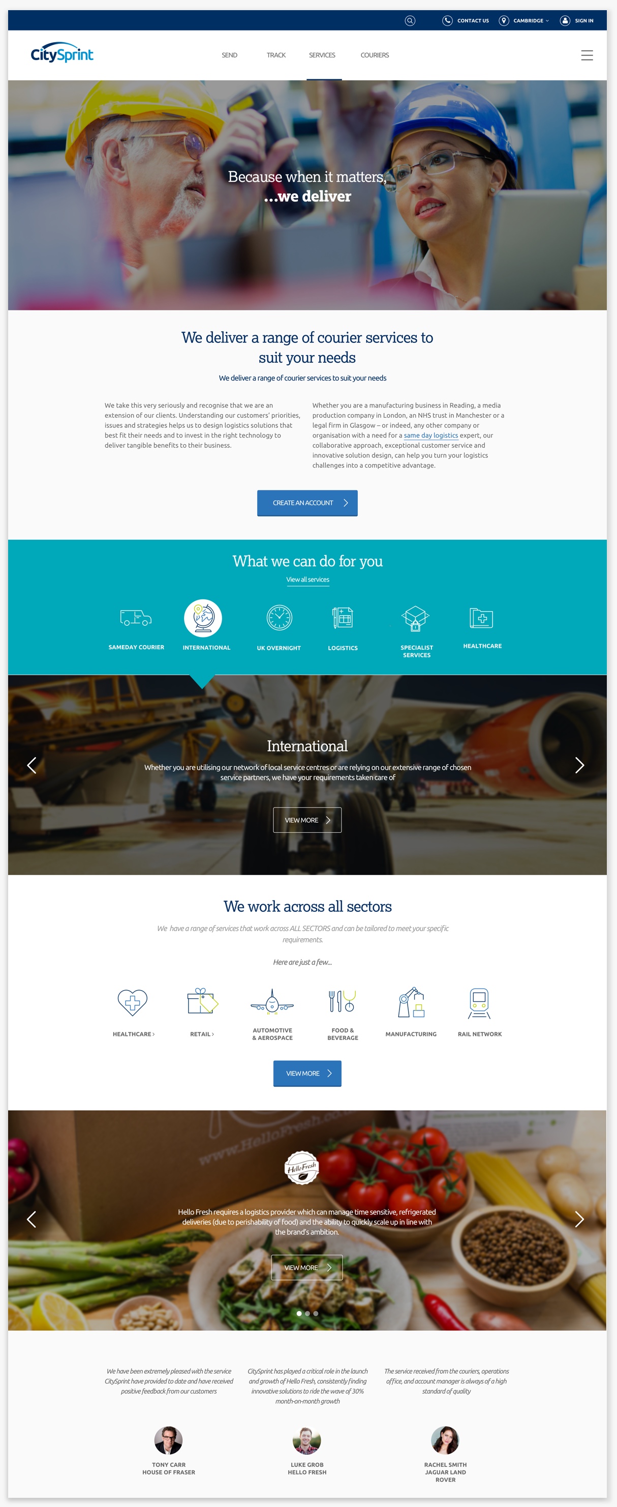
In order to support account sign up, I designed a dedicated services page which houses bite size content and banners linking to more detailed information across sectors and services ensuring content is quickly accessed with the option to deep dive further. Additionally, case studies and testimonials were also used in order to support City Sprint's reputation as a trusted supplier. City Sprint's new visual identity including revitalised photography and iconography was also utilised adding to the overall experience.
Outcome
Work with City Sprint resulted in the company experiencing an increase in online account requests and a reduction in bounce rates across the booking platform. Additionally we were commissioned to then work across their other digital projects and sites.
Why not drop me a line?
If you have an upcoming project and need help, I'd love to be involved! Just get in touch and let's get started.