Improve exam registration and NPS for tax professionals online
The Chartered Institute of Taxation
In order to offer the best service to their members and stakeholders, The Chartered Institute of Taxation (CIOT) wanted to build an online experience based on their user's needs and create a sense of purpose and endeavour amongst its members. As the Lead Experience Designer on the project it was my role to both research CIOT's many users and design a solution that met their goals.

Overview
The CIOT is the leading body in the UK for taxation professionals dealing with all aspects of taxation. Their primary purpose is to promote education in taxation. Membership to CIOT is by examination and is recognised as the gold standard of UK taxation education. As lead designer, my role on the project was to research and document CIOT user needs and pain points, presenting this back to both the project team and senior stakeholders within CIOT. I was also tasked with designing a solution that delivered against the research whilst meeting CIOT's objectives.
-
19%
Decrease in support calls -
35%
Increase in online bookings -
81
Net Promoter Score
Skills & Tools
Google Analytics
User Interviews
Exit Surveys
UX Review
Competitor Analysis
User Journeys
Personas
Experience Mapping
Information architecture
Prototyping
Interactive Design
Visual Design
Design Systems
Hotjar
Sketch
Photoshop
Invision
Discover
In order to understand more about CIOT's digital eco-system I used Hotjar to set up screen recordings, heatmaps, and exit polls. Google Analytics was also used to pinpoint drop-off points and assess site performance. This was further supported by a UX review of the various portals. Early indicators confirmed that basic tasks and navigation were hard to achieve with users often calling CIOT's in house support team.
Over 20 members and students were interviewd in order to support the current findings, revealing that students were feeling unsupported when taking or researching the certification, leading to disenchantment with CIOT. Many members viewed the certification as merely a means to an end and felt disconnected from the organization. Looking at various affiliate sites it was quickly becoming clear that there were more engaging ways CIOT could connect with their members.
Define the challenges
Understand exam requirements
Prospective and current students find it difficult to access basic exam information as well as choose the appropriate modules based on their previous qualifications. This is in part due to poor design but also to the fact that exam information was also hosted on different portals.
Continually support users
After interviewing a wide number of CIOT stakeholders and consildating findings in an experience map (above) it was clear that users had very different needs depending on their role and experience. In particualr the map hilights specific flashpoints during the user's interaction with CIOT where needs are not being met.
Engage and inspire
Members and students alike indicated that they felt no affinity with CIOT and viewd the organisation simply as a qulaification provider. It was clear that in order to still be relevant, CIOT needed to foster relationships with students and members and clearly demonstrate the value they provide to the tax community as a whole.
Develop the solution
Understand exam requirements
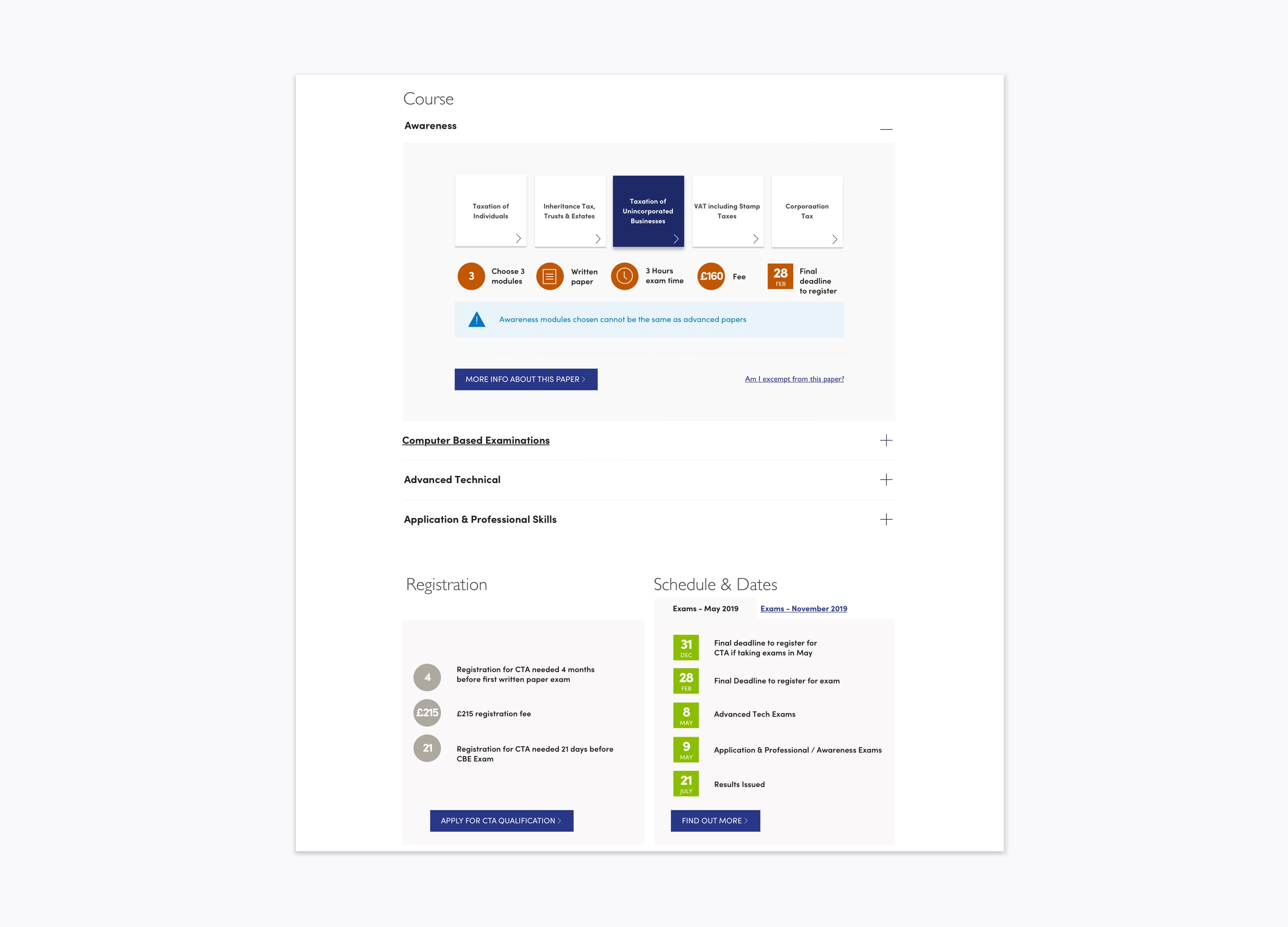
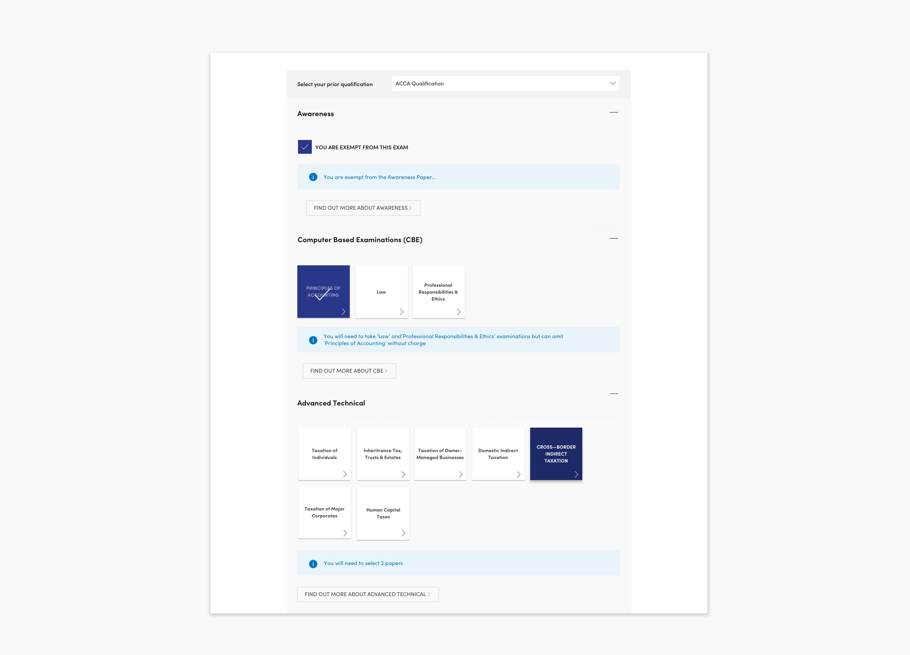
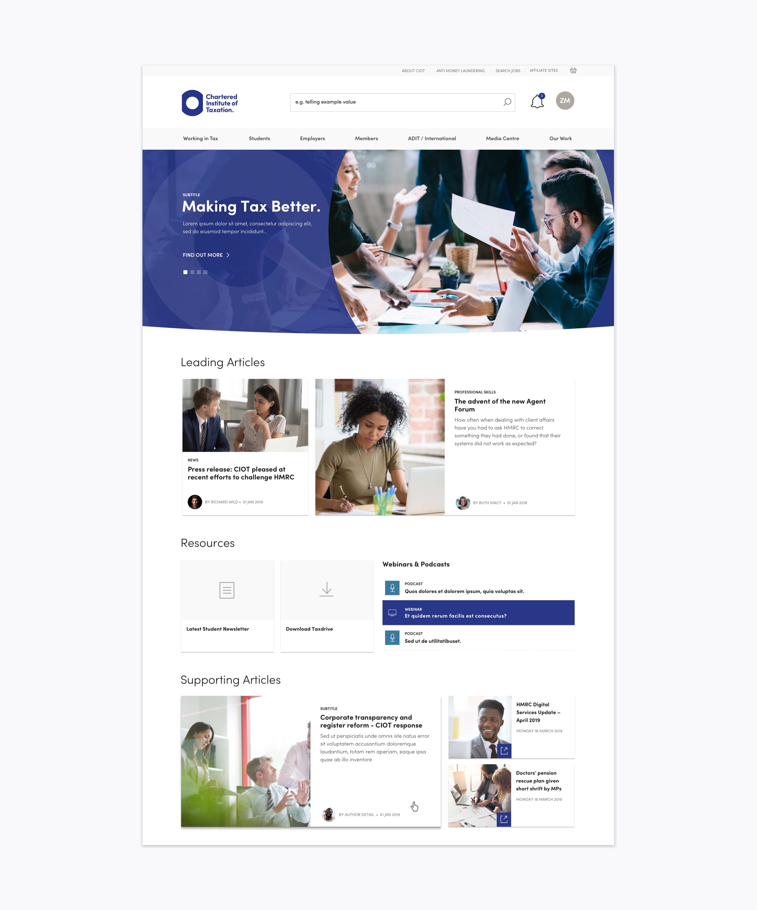
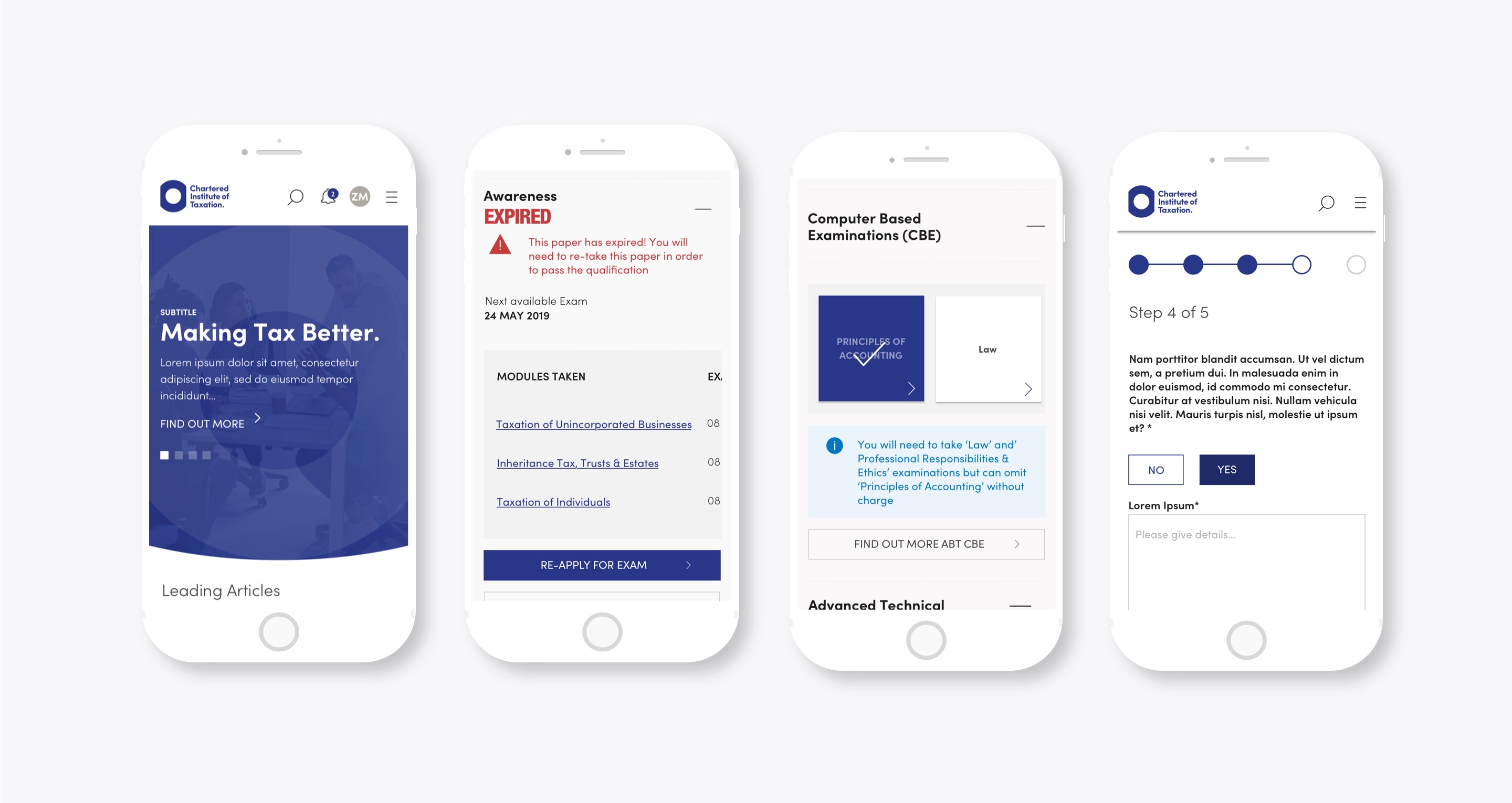
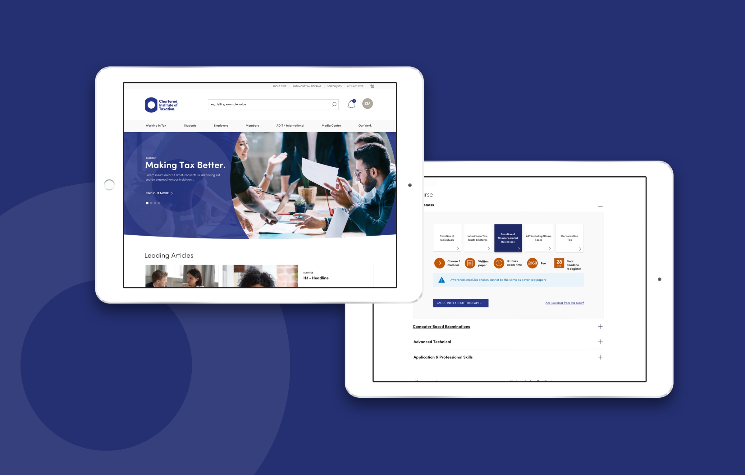
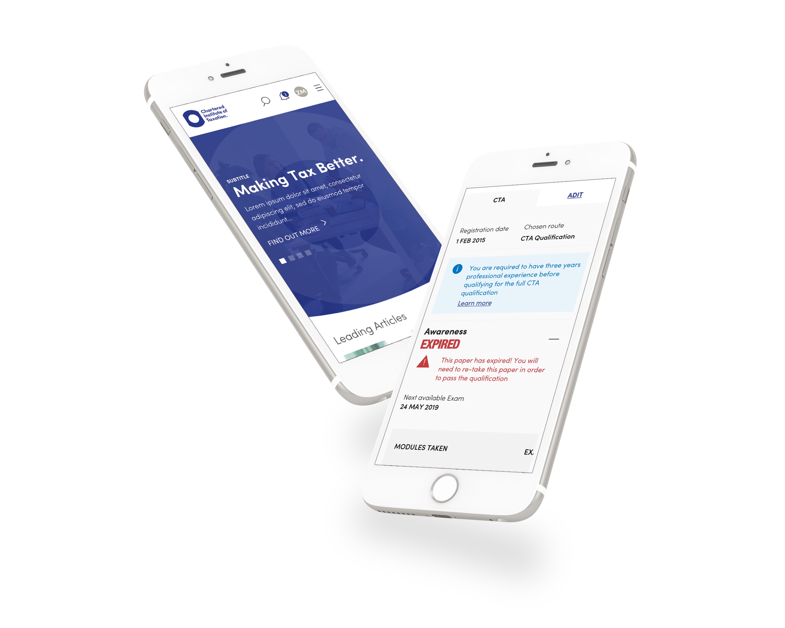
Understanding basic exam information such as duration, modules required etc. is quickly summarised on a single page supported by iconography. Accordions would ensure users wouldn't be overloaded by content and CTAs were added, enabling students to discover more detailed information should they wish. Students needing to understand which exemptions applied to them only need to select their current qualifications from a drop list rather than hunt through tabled information and PDFs.
Continually support users
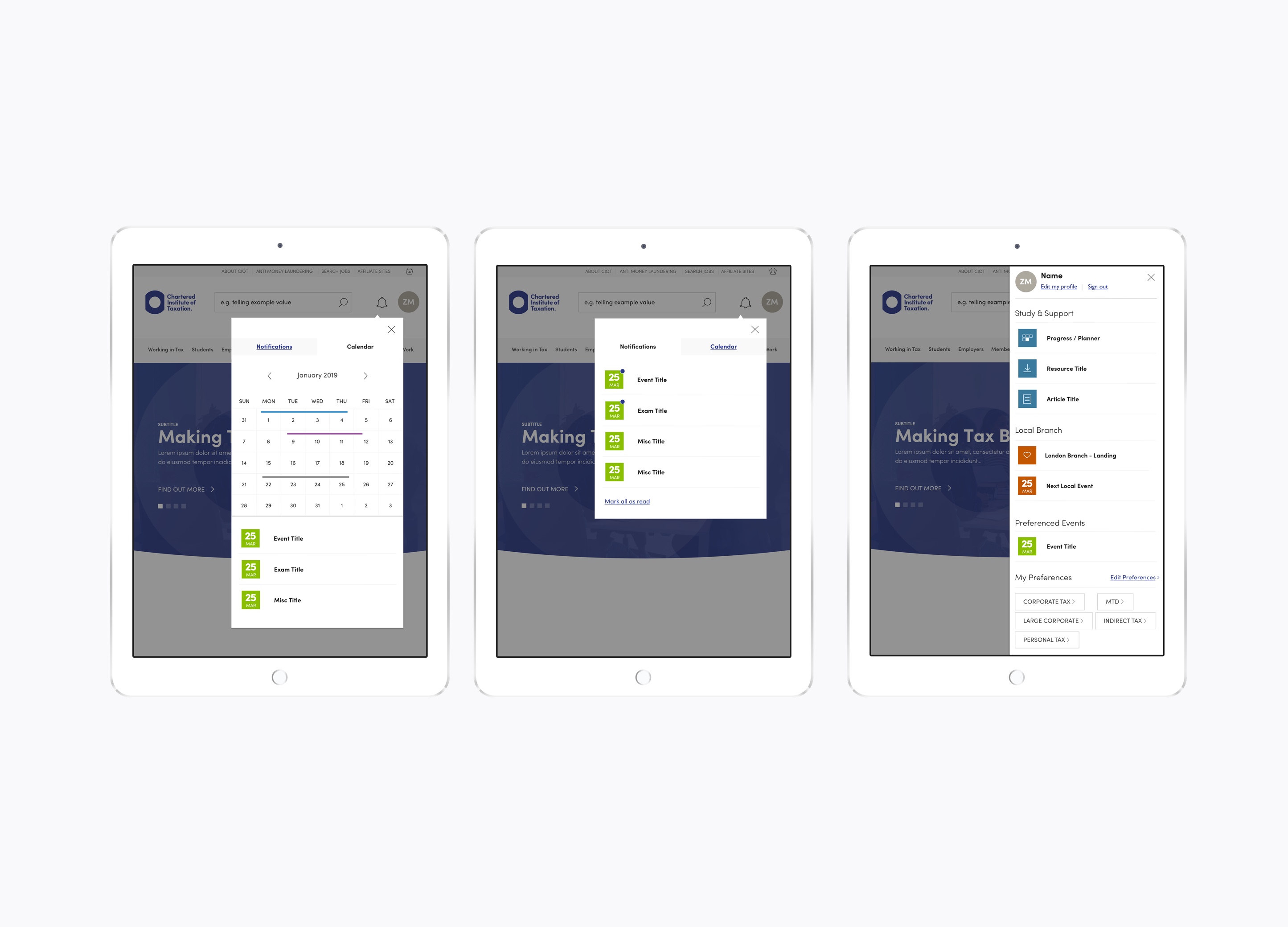
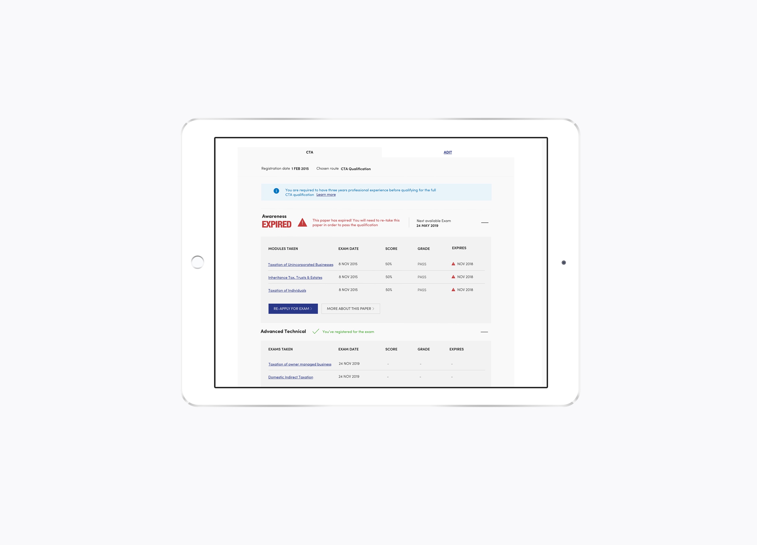
Creating a calendar and notifications feature would ensure that students and members received time based alerts for common tasks such as exam registration and events reminders. The account navigation would also provide quick links to relevant events and content as well as the exam planner which unlike the current platform would be located in one central space. The exam planner would also provide contextual information and links to the student confirming results as well as providing supporting information. This also works for employers too who need to monitor students studying for the CTA certification.
Engage & Inspire
Research had continually reaffirmed that CIOT didn't always own the relationship with their students, instead they were seen as merely examination providers. By creating content and imagery that engaged and humanised the world of taxation they have started to re-address the balance. In particular, supporting prospective students with a decision-tree and contextual content proactively put's CIOT in the driving seat. By creating branch event pages and dedicating a top level navigation section to their work CIOT will also begin to inspire their current members.
Outcome
By supporting an extensive period of research CIOT had to adjust their own objectives in order to meet their user needs. Original ideas such as promoting their heritage were sidelined in favour of facilitating immediate day-to-day user needs and building relationships which in the long run would secure the organisation's relevancy amongst its members.
Why not drop me a line?
If you have an upcoming project and need help, I'd love to be involved! Just get in touch and let's get started.